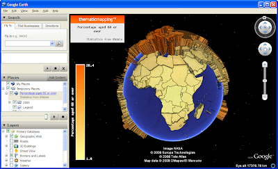
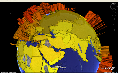
Map legends are important in thematic mapping, but KML/Google Earth has no build-in legend support (except the list view of map elements). I think the best workaround is to add a legend using the KML ScreenOverlay element. Unfortunately, this element only supports image overlays and not HTML layers. This makes it harder to create a dynamic legend that changes with your data.
Still, there are options: GD is an open source graphics library for dynamic creation of images. Using this library you can build a legend by adding colour scales and text to an image canvas. GD is written in C with bindings available for various languages.
The legend and map title shown in this screenshot are created using PHP-GD image functions, stored in a KMZ archive as PNG images, and added as screen overlays. You can download the KMZ file here.
Saturday, 31 May 2008
Thursday, 15 May 2008
Better KML rendering with Google Maps API for Flash?
Yesterday, Google launched their new Google Maps API for Flash. A Flash version will hopefully have better vector rendering capabilities than the JavaScript based API.
Most of the current map APIs quite cleverly use use the build-in vector support in Firefox and Internet Explorer (and others). Firefox supports Scalable Vector Graphics (SVG), while Microsoft use the obsolete Vector Markup Language (VML). The Google Maps API and OpenLayers API automatically check your browser and draws the vectors with the appropriate technology.
But the SVG/VML/DOM technology has some serious performance issues - if you add many complex polygons the browser will run terribly slow. While we wait for HTML 5 (and browsers to support it), Flash APIs might be a better solution.
I recommend Prince McLean's articles about the Flash Wars.
UPDATE 8 JUNE 2008:
Guilhem has made a nice tutorial of how choropleth maps can be created with Google Maps Flash API. He uses the World borders dataset available on this site. The Flash API has currently no way to load geometries from a KML file, so Gulheim manually creates the country polygons through API calls. Try his application and see the benefits of using Flash compared to a SVG/VML/DOM approach an this site (using Google Maps API).
Hopefully, Google will include KML support in a future release of Google Maps Flash API. I also miss a JavaScript API, - so the Flash version could be used as the Google Maps API or the new Google Earth API. And what about encoded polyline support in KML?
Wednesday, 14 May 2008
Animated Colladas in Google Earth
My second animation tip: KML embedded COLLADA objects can be animated by using the time primitives similar to what I did for prism maps.
See video:
The advantage is smaller file size compared to prism maps, since only one COLLADA model is used. Still you have to link in this model for all countries in all years (around 4000 times in this animation). A better way would be to be change the size parameters dynamically, but this is so far not possible with KML.
Download KMZ archives here and here:
Population statistics from UNdata.
Tuesday, 13 May 2008
Animated prism map in Google Earth
By using the time primitives in KML, you can create animated thematic maps showing how a variable change over time.
The prism maps above visualise the world population in four different years (1950, 1975, 2000 and 2050). This and this blog posts show how a prism map can be made with KML. Here, I've added country polygons for several years, each extruded and colourised according the the population value.
All polygons for one year are wrapped in a Folder with a TimeSpan element. Whenever time is specified in a KML file, a time slider appears in upper-right corner of Google Earth (I've not seen this functionality implemented in other geobrowsers). By dragging this slider, you'll see the human population explosion visualised:
You can download the KMZ file here and try yourself. The file is big (1 MB) because the complex country polygons have to be repeated for each year in the animation. It's not possible to change altitude values dynamically with KML. It'll be on my list of feature requests...
Population statistics from UNdata.
Monday, 5 May 2008
Prism maps in Google Earth and UUorld
In an earlier post, I showed how KML can be used to create 3D choropleth maps or prism maps. A prism map is a statistical surface map viewed in perspective (1). It's the recommended way of visualising numerical data using choropleth mapping (2). See these examples showing internet users in the world:
This choropleth map shows the number of internet users per 100 population in 2005 (see this post for more information about the map). Even though it's possible to see that one shade is lighter or darker than another, it's impossible to see that the shade for one country is twice as dark as another. It's better to use this type of choropleth maps with nominal or ordinal data, and not numerical data (interval or ratio measurements).
This image shows the same data visualised in Google Earth (the problem with holes in extruded polygons is described here). The height (and colour) is proportional to the percentage of internet users. This prism map portray ratios correctly, - a country having twice as many internet users (in percent) as another will be represented by a prism twice as high. The advantage of using Google Earth is that the globe is easily rotatable in all directions, and the user can thereby avoid the problem that tall prisms sometimes block smaller prism. But the globe view can also be challenging, as it's not possible to see the whole world at a glance.
UUorld has specialised in animated prism maps. Instead of using a globe, the units are extruded from a flat surface. The surface can be zoomed, tilted and rotated in every direction. This video shows the capabilities of UUorld, and also an alternative view when visualising raw totals instead of percentages. I will later show how prism maps can be animated in Google Earth.
An alternative to prism maps is to use proportional symbols or pie charts. The size of the chart could be proportional to the total population, while the pie chart could show the percentage of internet users.
References
1. Multimedia Cartography, 1995, William Cartwright, Michael P. Peterson and Georg Gartner, Springer
2. Thematic Cartography and Geographic Visualization, Second Edition 2005, Terry A. Slocum et al., Pearson Education, Inc