
It’s seems like people have a love/hate relationship with prism maps. Here are some of the arguments in the “don’t like” category together with my counter-arguments:
“IMHO creating coropleth maps using prisms is not really *efficient* (but of course it’s spectacular) because it’s really hard (at least for me, maybe I’m too “plain”) to realize slight differences between non-contiguous areas. In fact you are using to techniques to present the same variable, color and prism height. As I see, the classic way to present a quantitative variable using the amount of brightness and just one value (color) is more efficient independently of using a 2D or a 3D environment.” (XuRxO)
“If I wanted to find out the exact value of oil consumption for a particular country on the thematic map I can easily glance at the colors in the key to pinpoint the value. With consumption converted to height in Google Earth its difficult to read off the actual value.” (Rich Treves)
“I was talking to some cartographer friends about the recent proliferation of 3D thematic maps and they had some concerns about their utility and accuracy. Specifically they pointed to testing that has shown people stink at estimating heights of the countries and have the hardest time telling the most basic differences in height.” (Sean Gorman)
I’ll stick to the “Infant Mortality Rate” visualisation introduced in my last blog post:
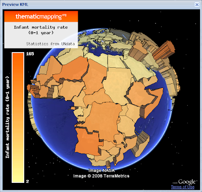 Prism map (download KMZ).
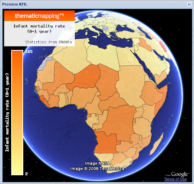 Choropleth map (download KMZ).
The best solution is to select a visual variable that match the level of measurements (nominal, ordinal or numerical) of the data (Slocum et al., 2005). Hue (colour) is the best way to represent nominal data, ordered hues (e.g. yellow, orange, red) or lightness are the best ways to represent ordinal data, while perspective height (prism) is the best way to represent numerical data (page 72). Clearly, brightness/hue is not the only "classic way" of representing numerical data.
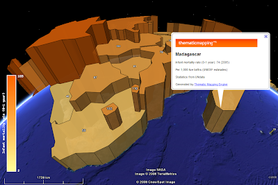
The reason why perspective height gets the highest rank by Slocum (2005/70) is that an unclassed prism map will portray ratios correctly, since a value twice as large as another will be represented by a prism twice as high. Slocum also identifies two problems of prism maps; that tall prisms sometimes block smaller prisms and that rotation might produce a view that is unfamilar to users. This is the topic of my next blog post in this series.
If you look at the two images above (or in Google Earth) I will argue that the prism map is able to convey more detail than the choropleth map. I find it easier to see how the infant mortality rate varies across the continent, and to compare countries adjacent to each other.
I agree with Rich that a colour legend helps the user to pinpoint a value, even though it's impossible to identify the exact value by this method. A height legend is diffult to make since the scale is changing. Still, I think legends are more important for paper maps than digital maps. On a digital map you should always be able to obtain the value by clicking a feature.
 In Google Earth, a Point Placemark is the only object you can click or roll over. You can click on a polygon by holding down the shift-key, but this is not very user friendly. Collada objects are not clickable at all. Google, I wont sleep well until this is fixed ;-)
In conclusion, - try a prism map if you deal with numerical data and have 3D at your disposal!
References:
Thematic Cartography and Geographic Visualization, Second Edition 2005, Terry A. Slocum et al., Pearson Education, Inc
“IMHO creating coropleth maps using prisms is not really *efficient* (but of course it’s spectacular) because it’s really hard (at least for me, maybe I’m too “plain”) to realize slight differences between non-contiguous areas. In fact you are using to techniques to present the same variable, color and prism height. As I see, the classic way to present a quantitative variable using the amount of brightness and just one value (color) is more efficient independently of using a 2D or a 3D environment.” (XuRxO)
“If I wanted to find out the exact value of oil consumption for a particular country on the thematic map I can easily glance at the colors in the key to pinpoint the value. With consumption converted to height in Google Earth its difficult to read off the actual value.” (Rich Treves)
“I was talking to some cartographer friends about the recent proliferation of 3D thematic maps and they had some concerns about their utility and accuracy. Specifically they pointed to testing that has shown people stink at estimating heights of the countries and have the hardest time telling the most basic differences in height.” (Sean Gorman)
I’ll stick to the “Infant Mortality Rate” visualisation introduced in my last blog post:
 Prism map (download KMZ).
 Choropleth map (download KMZ).
 The best solution is to select a visual variable that match the level of measurements (nominal, ordinal or numerical) of the data (Slocum et al., 2005). Hue (colour) is the best way to represent nominal data, ordered hues (e.g. yellow, orange, red) or lightness are the best ways to represent ordinal data, while perspective height (prism) is the best way to represent numerical data (page 72). Clearly, brightness/hue is not the only "classic way" of representing numerical data.
The reason why perspective height gets the highest rank by Slocum (2005/70) is that an unclassed prism map will portray ratios correctly, since a value twice as large as another will be represented by a prism twice as high. Slocum also identifies two problems of prism maps; that tall prisms sometimes block smaller prisms and that rotation might produce a view that is unfamilar to users. This is the topic of my next blog post in this series.
If you look at the two images above (or in Google Earth) I will argue that the prism map is able to convey more detail than the choropleth map. I find it easier to see how the infant mortality rate varies across the continent, and to compare countries adjacent to each other.
I agree with Rich that a colour legend helps the user to pinpoint a value, even though it's impossible to identify the exact value by this method. A height legend is diffult to make since the scale is changing. Still, I think legends are more important for paper maps than digital maps. On a digital map you should always be able to obtain the value by clicking a feature.
 In Google Earth, a Point Placemark is the only object you can click or roll over. You can click on a polygon by holding down the shift-key, but this is not very user friendly. Collada objects are not clickable at all. Google, I wont sleep well until this is fixed ;-)
In conclusion, - try a prism map if you deal with numerical data and have 3D at your disposal!
References:
Thematic Cartography and Geographic Visualization, Second Edition 2005, Terry A. Slocum et al., Pearson Education, Inc
Comments
Probably I'm too plain :)
I have to accept that the height of the prisms are more efficient to guess the relative value between features.
Anyway, nice and useful job
Cheers
Nice post - one of the way around polygons not being clicable in Google Earth is to use multigeomtry polygons where you embed a pushpin in the polygon that lights up the polygon when you mouse over. We use this for the KML we generate in Google Earth. It has it own issues and would love to see Google fix it optimally. There is a nice post by Jason Birch on how to do it here:
http://www.jasonbirch.com/nodes/2006/10/18/38/using-multigeometry-for-mouseover-effects-in-google-earth-kml/
In regards to prism I'm still curious how to deal with the variation in height caused by the curvature of the globe. I may have South Africa in the foreground and its height looks the same as Chad (to the North) because of the loss of height for Chad caused by the curvature of the earth. Color helps with this but can still be a bit confusing.
Thanks for the highlighted polygon tip. I'm using a similar technique to display values on top of the prisms, - but I was not aware that I could highlight the whole prism. Still, I think the icons distracts the user - so I'm waiting for a Google fix.
I acknowledge the challengeges caused by both perspective and the the curvature of the earth.