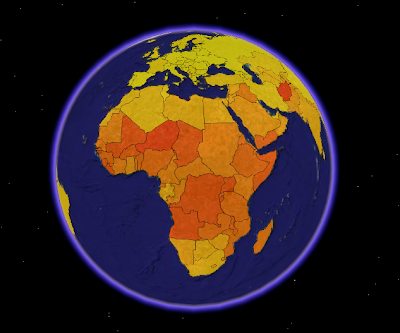
Now that we have world borders, a spatial database, some PHP code and statistics, - it's time to start the fun stuff: making thematic maps! I've started width choropleth maps (shaded polygons), and the first results can be seen by downloading this KML to Google Earth, or by looking at the images below.
 This screenshot from Google Earth is a visualisation of the world fertility (children per woman) 2000-2005. Darker colour means higher fertility. Afghanistan has the highest fertility in the world (7,5 children per woman). The data are unclassified, the countries are coloured according to their fertility value on a colour range.

 This screenshot from Google Earth is a visualisation of the world fertility (children per woman) 2000-2005. Darker colour means higher fertility. Afghanistan has the highest fertility in the world (7,5 children per woman). The data are unclassified, the countries are coloured according to their fertility value on a colour range.
On this image, the fertility values are also represented by the height of the country polygons. I find it easier to see differences between countries by using this visualisation technique.
KML is not the optimal format for choropleth mapping in Google Maps. My KML file was too big, so I had to generate a new showing only African countries.
Fertility data are from UNdata. World borders can be downloaded on this site. I can not guarantee that the areas represented by statistical values and the mapped areas are identical, since the data are from two different sources.
Comments
You might think about, if you're having trouble with files that are too large for Maps, going with a view-based NetworkLink, which queries a script based on the view parameters. This works in Maps and Earth.
@kosjoli (appreciate if you ping me! :)