Friday 9 September 2016

Creating TINs in SAGA GIS

This blog post is part of an ongoing effort to find the best open source tool for Triangulated Irregular Networks (TINs).

Nathan Saylor recommended me to try SAGA GIS, which has various tools for TINs. I've never used SAGA before (here is a quickstart tutorial), and the first challenge was to get it running on my MacBook. The easiest option was to use Homebrew:

brew tap osgeo/osgeo4mac
brew install saga-gis --with-app

I first converted my DEM into a grid format supported by SAGA, and also reduced the resolution from 10m to 100m to avoid out-of-memory issues on my laptop: 

gdal_translate -of GSBG -outsize 600 600 jotunheimen.tif jotunheimen_100m.grd

My SAGA installation is a bit rusty. I need to open the dataset twice ("File > Grid > Load" or by using the File System tree) before it actually loads. 


You'll see your dataset in the Data Manager. Above the datasets your see some numbers: 

100; 600x 600y; 432050x 6790050y

The first number is the cell size (100 meters), the next two numbers show the number of cells in x and y direction (600 x 600 px), and the last two numbers are the origin of the grid (my dataset is in UTM 32N). 

You'll find the TIN tools under Geoprocessing > TIN > Conversion: 


Unfortunately, the tools are poorly documented, so we need to experiment a bit. When I tried "Grid to TIN" I got (599 x 599 * 2 = 717,602 triangles for my 600 x 600 = 360,000 pixels, which is not very efficient. This is similar to the technique I used to create a triangle mesh in three.js


We need to to better, and "Grid to TIN (Surface Specific Points)" gives you some more options:


I'm not sure how the different methods are working, and if they can be combined by setting different thresholds below. Please give me some hints if you know some theory and best practices for terrains like this. 

I first used the defaults (Opposite Neighbours). I'm not friends yet with the map/3D-viewer of SAGA, so I'm exporting my TIN so I can enjoy it in other applications. The export tool is hidden under Geoprocessing > File -> Shapes -> Exports -> Export TIN to Stereo Lithography File (STL). 


I then opened the file in MeshLab:


Ok, it's promising, you can clearly see the big triangles for lakes, and smaller triangles when the terrain is rough. I got 172,128 triangles, about one-forth of a regular mesh. But it's not good enough, as I see that parts of the lakes are not horizontal. Which settings should I use to fix it? 

Still needs investigation: 
  • Is it possible to run TIN functions from SAGA on the command line? Does SAGA CMD work on Mac? 
  • How big dataset can SAGA handle? 

Do you want to contribute to this tutorial? Please add your comments below! 

Wednesday 7 September 2016

Creating a TIN from a raster DEM

NB! This blog post will constantly change until I find a good open source solution to create a Triangulated Irregular Network (TIN) from a Digital Elevation Model (DEM). Would you like to help? Please add a comment below!

NEW! Read the first test of the TIN capabilities of SAGA GIS.

People have already helped on Twitter, and I'll include some of these suggestions in this post.

My example DEM of Jotunheimen in Norway can be downloaded here (144 MB GeoTIFF). This is the same dataset I've used previously for my terrain mapping experiments with three.js and Cesium.


The goal now is to turn this raster DEM into a nice triangulated irregular network (TIN) optimised for 3D rendering. 

The dream solution would be a command line tool (part of GDAL?) that can turn a raster DEM into an optimised TIN.

Open source candidates: 


GIS StackExchange

Commercial tools: 

Sunday 21 August 2016

The history of the Telemark Canal - projected on a physical landscape model

Together with Jon Olav Eikenes and Christan Løverås, I'm part of a new startup called Norviz. The main focus so far has been on projecting animated graphics onto physical landscape models. Our first job was to tell the history of the Telemark Canal, a beautiful waterway connecting the sea and the interior through eight locks at a distance of 105 km from Skien to Dalen in Norway.


The installation was made for West Telemark museum, and is now on show in Vrangfoss, the largest lock complex on the canal with five locks and a lift of 23 metres. The 3D model displays a 10 minutes map animation showing the history of the canal together with historical images, voice and sound effects.

Here are some of the technical details which might interest my readers :-)

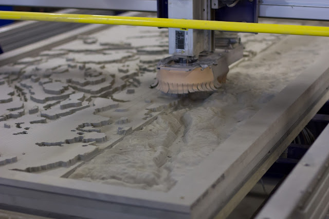
The digital elevation model was prepared in Blender and cutted with a a CNC router. It took the machine about 30 hours to finish the whole model.

Cutting a large 240x110 cm model of the Telemark Canal in Valchromat. 
Time-lapse of the cutting process:


After two coats of white paint, our model became a nice canvas for our map animation. Fun to see the geological structures from above.

Setup and calibration in an old barn at Vrangfoss. The video projector was mounted 4 meters above the model.   
The various maps telling the story of the canal was rendered with Mapnik before adding transitions and special effects in Adobe After Effects. With the help of three.js and some homemade scripts, we were able to align our map animation with the uneven landscape surface. Lastly we used JavaScript for Automation (JSX) to link and synchronise the the different parts of the installation.

The final installation showing graphics projected on the physical landscape model. 
From Varden newspaper 28 June 2016.

See it live at Vrangfoss during summer season while the canal boats are operating!

Are you interested in collaborating with us or help us fill the world with engaging visualizations? Please don’t hesitate contacting us!


Map data from Kartverket.
Concept and story by Indici and West Telemark museum.
Photos above taken by Jon Olav Eikenes.

Saturday 16 April 2016

Finding your way with OpenStreetMap

OpenStreetMap is not only for streets, it also contains an impressive amount of hiking trails. I’m currently planning a a week’s hike in June, crossing the Alps from Oberstdorf to Vernago. How can I extract the route from OpenStreetMap and use it on my GPS?

The route visualised in CartoDB. Interactive version.
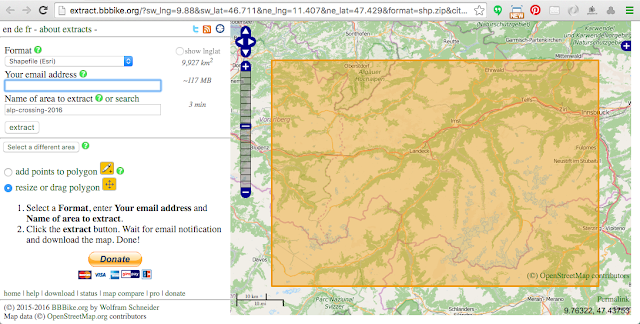
The BBBike extract service allows you to download OSM data for your region of choice.

You can select your area of interest by using the map interface, or by specifying the map bounds coordinates. 
I selected an area covering the entire route, and ordered the data in a Shapefile format. Within a minute I received an email with a download link.

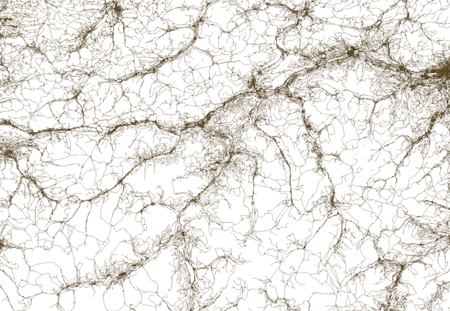
The extract contains 8 shapefiles, and we only need the roads shapefile, which also contains hiking trails. If I open the shapefile in QGIS it looks like this:

Roads and hiking trails in the Alps.  
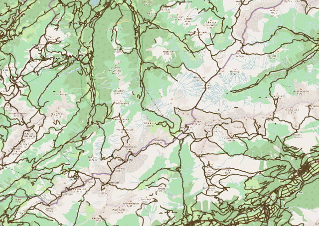
You'll have great difficulties finding your trail on this map, so let's add a basemap from OpenStreetMap.  Save this as an XML file on your computer:


Drag the file onto your QGIS dashboard. If you do this before loading the roads shapefile you'll make sure that they are displayed in the same projection, and that the roads and trails are shown on top:

OSM road network shown on top of OSM map tiles in QGIS.
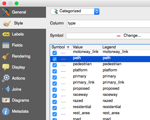
It's still hard to distinguish hiking trails from roads, as they all look the same. We can easily change the style of hiking trails in the style editor:

Select categorized style and give the path type an extra boost so it stands out on the map. 
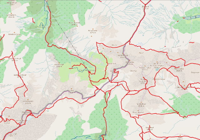
The paths are now easier to see:

Paths marked in red.
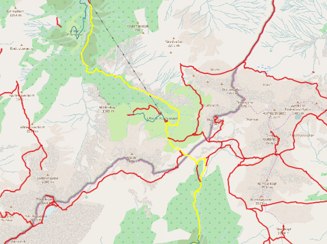
Next we need to select the path we plan to follow. Use the "Select Features(s)" tool and click on the path segments you plan to follow.


Select the path segments you plan to follow. 
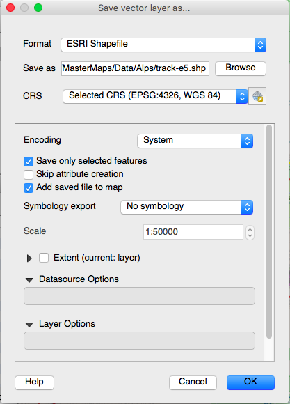
When you've marked your route, you can right click the roads layer and select "Save As...". Check that you only want to save selected features:

Save your track as a new shapefile.
It's best to have your route as a continuous line (or one for each day if you're on a long trek), and you can use the "Join multiple lines" plugin in QGIS to achieve this. The plugin will also handle gaps in your route by drawing a direct line between them.

Just select the full path and click on "Join multiple lines". Save the results. 

We now have a shapefile of our planned hiking route, thanks to OpenStreetMap, BBbike and QGIS.

Next, I want to upload the shapefile to CartoDB to create an interactive map showing of the route (also shown as the first image above). You can also study the route on top of detailed aerial imagery from Bing on my tracking site:

Interactive version (click on "Route" in the top menu.
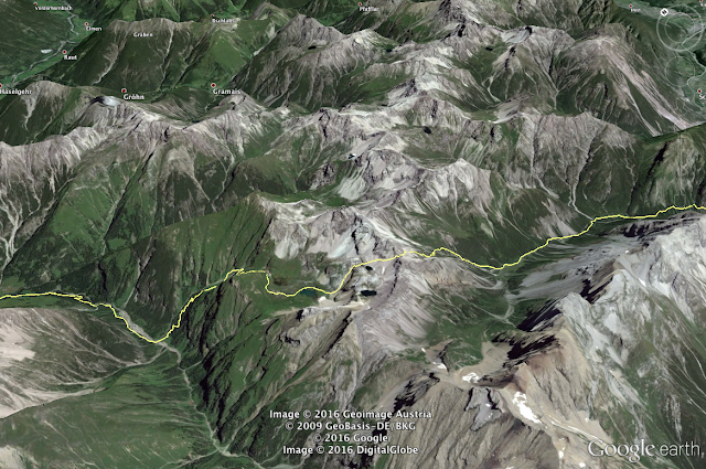
You can also save your track as a KML file in QGIS, and open it in Google Earth - a great way of getting a visual impression of the hike before you go.

Planning your hike with Google Earth. 

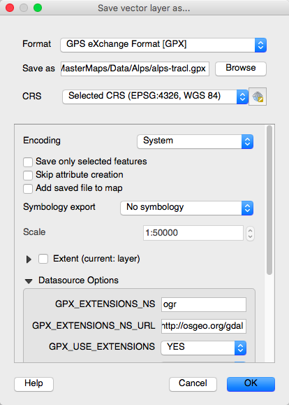
The last step is to upload the track to your GPS so you can use it for navigation. Open the track shapefile in QGIS, and save it in the GPX format.

Right click the track layer and select "Save As..."

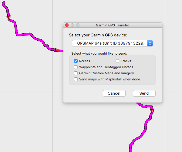
I then use Garmin Basecamp to transfer the route to my GPS:

Transfer the route to your GPS device.
Then we're ready for takeoff!

Saturday 26 December 2015

Mapping a real time snow cover

Norway is a country with huge climate variations between seasons, lowlands and mountains, coastal areas and inland, and between north and south. In the recent years, we have also seen more extreme weather and greater fluctuations in temperature and snow cover. At the same moment of time there might be meters of snow in the mountains, while the trees are blooming by the fjord a few kilometers away. Outdoor activities are popular among citizens and tourists alike, and in Norway you can do typical summer and winter activities all year around. The goal of this blog post is to create a near real time map of the snow cover, where the snow blends into the landscape.

The snow map of Jountunheimen we're going to create.

As shown on this blog, I like to create maps and 3D visualisations using a wide range of open source tools, combined with various programming techniques. This snow mapping experiment is no exception. Open Source allows me to mix and match the tools and techniques I need, and doing this programmatically has the added benefit of automation. When the full map making process is defined, we can easily run it for various areas and terrains. It was an important goal of this project to keep the snow cover up­-to-­date on a daily basis.

Cross­country skiing in Jotunheimen national park. Photo: Bjørn Sandvik
Geospatial datasets can be very large, and we often have to divide the data into chunks to be able to run calculations. I have divided mainland Norway into 218 cells, each covering an area of 50 x 50 km. With datasets at 10 meters resolution, all tools presented below were capable of processing the data.

The Norwegian Mapping Authority released its topographic datasets in 2013. This included an elevation model of mainland Norway at 10 m resolution. The Norwegian Water Resources and Energy Directorate (NVE) is monitoring the country's water resources, and they provide data of snow gain, snow melt and snow depth. As my map is aimed towards cross­-country skiers, I’m using a dataset showing areas with a skiing surface, based on interpolated weather observations.

Elevation data
The 10 m digital elevation model (DEM) from the Norwegian Mapping Authority was used to blend the snow into the landscape. A few GDAL commands allowed me to create a 50 x 50 km DEM from the nation­wide DEM, and to translate it into the various formats supported by the tools in use.

The 10 m elevation model contains too much detail to represent a snow cover. I could downsample the dataset, but that would blur out important terrain features like mountain ridges and valley edges. Terrain Sculptor came to the rescue. It is a tool by Bernhard Jenny and Anna Leonowicz to generalize terrain models for relief shading. It removes unnecessary and distracting terrain details, and better resembles a smooth snow covered landscape. Unfortunately, Terrain Sculptor can only be used with a graphical interface, and not as a command line tool, so it can not be used in an automatic process. I used it to create a generalised terrain model for the 50 x 50 km area of Jotunheimen and Tyin.

The generalised elevation model was used to create a shaded relief. We can easily create a grayscale hillshade with GDAL, but the snow required some tints to look better. I created a continuous colour scale from blue shadows to white with a touch of yellow, and turned the grayscale hillshade into a tinted hillshade. For areas without snow, I used the same elevation data to create a color relief progressing from green for lower elevations up through yellows/browns, and on to grays and white at the highest elevations.

Finally, the elevation model was used to calculate steep terrain (slope) where there will be less snow. The steep terrain will be subtracted from the snow surface to improve the view in alpine areas. This was achieved in a series of steps: A slope surface was calculated from the DEM, and then areas steeper than 50 degrees were extracted and vectorised. The process of vectorising raster data is described below.

Snow cover
The skiing surface dataset from the Norwegian Water Resources and Energy Directorate (NVE) is available from a public Web Map Service (WMS) with a 1 km resolution. The dataset is updated 8 times a day. The original WMS image includes 4 colours: Blue represents skiing surface with dry snow, violet is surface with wet snow, yellow is areas with little snow, and green is areas without snow. As the map is targeted towards cross country skiers, the dry (blue) and wet (violet) snow are combined into one layer. The areas with little snow (yellow) are not included in this map, but could be used to create a more gradual shift between snow cover and bare ground.

The original WMS image of skiing conditons.

Wet at dry skiing conditions combined. Each square is 1 x 1 km. 

To avoid the pixelated appearance of the snow surface, the image is vectorised into smooth scalable snow polygons. This was achieved using Potrace by Peter Selinger, an open source tool for tracing bitmaps. Potrace transforms the the blocky WMS image into smooth vectors. It supports GeoJSON output, which makes it easier to use in geographic applications. A problem with this technique is that the smooth polygons seem more accurate than they are. There are other, and probably better, ways to interpolate the data, as following height contours in the area.

Vectorised image from Potrace.

With all the map layers in place, Mapnik was used to generate the map shown below. Mapnik is an open source toolkit to generate beautiful maps from different vector and raster sources. The order and styles are expressed in an XML document, and then applied to the data. First, colour relief, lakes, snow polygons, steep terrain, glacier polygons and road lines are added in turn. Then all the layers are blended with the hillshade, before adding buildings and a thin lake outline as a final touch.

Jotunheimen and Tyin covered with a snow cover obtained from the Norwegian Water Resources and Energy Directorate on. The map image is applied to a 3D model using elevation data from the Norwegian Mapping Authority.


Friday 6 November 2015

Mapping grid-based statistics using OpenLayers, Three.js and D3.js

I've just finalised two tutorials on mapping grid-based statistics. The tutorials are in Norwegian, but the source code is available in English, and should be easy to follow.

Tutorial 1: "Grid-based population data"

Mapping grid-based population data of Oslo, Norway, using OpenLayers 3 and D3.js. The user can select an area to see the number of inhabitants.


Tutorial | Demo | Source

Tutorial 2: "Grid-based statistics in 3D"

3D visualisation of grid-based population data of Oslo, Norway, using Three.js and D3.js.


TutorialDemo | Source

The basemap is from the Norwegian Mapping Authority, and the grid-based population data from Statistics Norway.

The tutorials are provided by Project Innovation from GeoForum, a Norwegian non-profit industry organization for individuals and companies/agencies working in mapping, surveying and geographic information.

Please notify me if you use these techniques in your own projects! 

Wednesday 14 October 2015

Mapping the Arctic sea ice

There as been a lot of attention about the diminishing Arctic sea ice in recent years. We’re often exposed to images showing the extremes. My goal was to show the changing sea ice month by month, and even day by day. Sea ice is a critical component of our planet because of its influence on the global climate.

The sea ice cover in the Arctic in September 2015. The black line is the median extent (1981-2010) for this month. See interactive version.


The graph shows the change in sea ice cover for September since 1979, in percent from the mean extent (1981-2010). September 2015 had the fourth lowest extent in the satellite record. See interactive version.

The National Snow and Ice Data Center (NSIDC) provides two great datasets collected by satellite of the Arctic Sea Ice:

Sea Ice Index
You get the longest time-series using Sea Ice Index, which dates back to November 1978. The dataset is available at 25 km resolution. The images and data are produced in a consistent way making it appropriate for use when looking at long-term trends in sea ice cover.

MASIE
MASIE is a newer dataset at 4 km resolution, which dates back to 2006. Recently they also made the dataset available at 1 km resolution (back to December 2014), which is great for regional maps. Use MASIE when you want the most accurate view possible of Arctic-wide ice on a given day.

This page further explains the difference between the two datasets.

Responsive map layout adapting to various devices. Image from Am I Responsive.

Polar maps are hard to make with popular mapping tools like Mapbox and CartoDB. I love these tools, and I use them a lot when the Mercator projection makes sense. But Mercator is a terrible match for polar data. Not only are the areas towards the poles greatly distorted, the world above 85°N or below 85°S simply don’t exist! While waiting for better projection support in these tools, you can try these hacks: Mapbox example, CartoDB example.

We should always pick the right tools for our job. For this project I ended with a geohipster stack of D3.js, GDAL and Node.js on Digital Ocean droplet. There is also a touch of CartoDB to store some tabular ice extent data, but no geodata this time.

D3 has great support for different map projections. I decided to use the same polar stereographic projection as the original sea ice datasets. This made it easier to keep the original resolution of the sea ice datasets. The only thing I did was to rotate the map to get Norway and Europe in the center - sorry to my North American readers ;-)

Sea ice maxiumum (March) and minimum (September) in 2015. See interactive version


There is a significant yearly cycle in sea ice cover, usually reaching a maximum in March, and a minimum in September. See interactive version.

Bonus information for the map geeks: The polar projection of MASIE and Sea Ice Index is not exactly the same - not only is the central meridian different (-80° vs -45°), the latitude of true scale is 60° for MASIE and 70° for Sea Ice Index. The first discrepancy is just a matter of rotating the images until they overlap. To fix the latter you have to alter one of the projections to allow them to line up.

I wanted my map to be up-to-date with the latest sea ice data available. I don’t have time to update the map every day - so I needed to do this in an automatic process. It was achieved by periodically checking for new data on the NSIDC servers, download the files and convert them to a web friendly format. The original GeoTIFF showing the sea ice extent on October 12 is 1.7 MB, while the compressed PNG shown on the map is just 12 KB, with the same 4 km resolution!

Animated GIF showing the changing sea ice extent from maxium in March 2015 to minimum in September. The animation is recorded directly from the website, showing the benefit of the highly compressed PNGs from an SSD cloud server. 

D3.js and SVG are a great match for responsive map layouts adapting to various screen sizes and resolutions. I wanted this map to be both mobile friendly and big screen friendly, and it was achieved using CSS3 flexbox and viewport units.

Please contact me if you’re interested in using this visualisation, or if you would like help on another mapping project.

Thursday 4 June 2015

Master maps

I’m going freelance over the summer, after 5 great years at the Norwegian Broadcasting Corporation (NRK). It was not an easy decision, but I have to try. I’ll tell more about my plans later. Please sign up to get notified about my services.

Some of the projects I've been working on at NRK:

The flexible mapping stack of NRK.no, allowing journalists and digital storytellers to create advanced maps in minutes. 

"Kartoteket" - our in-house mapping tool built on top of our mapping stack.

Digital storytelling using NRKs mapping stack and Mapbox. 

Digital storytelling using NRKs mapping stack and Mapbox. 

Flood maps using NRKs mapping stack and CartoDB.

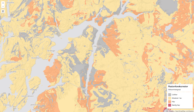
Radon affected areas in Norway using NRKs mapping stack.

Our popular photo maps

Video map of the long running TV show Norge Rundt.
Tracking of "Sommerbåten" along the coast of Norway.

Other work.