
In an earlier post, I showed how KML can be used to create 3D choropleth maps or prism maps. A prism map is a statistical surface map viewed in perspective (1). It's the recommended way of visualising numerical data using choropleth mapping (2). See these examples showing internet users in the world:
 This choropleth map shows the number of internet users per 100 population in 2005 (see this post for more information about the map). Even though it's possible to see that one shade is lighter or darker than another, it's impossible to see that the shade for one country is twice as dark as another. It's better to use this type of choropleth maps with nominal or ordinal data, and not numerical data (interval or ratio measurements).
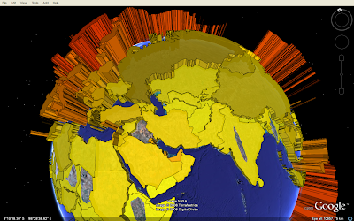 This image shows the same data visualised in Google Earth (the problem with holes in extruded polygons is described here). The height (and colour) is proportional to the percentage of internet users. This prism map portray ratios correctly, - a country having twice as many internet users (in percent) as another will be represented by a prism twice as high. The advantage of using Google Earth is that the globe is easily rotatable in all directions, and the user can thereby avoid the problem that tall prisms sometimes block smaller prism. But the globe view can also be challenging, as it's not possible to see the whole world at a glance.
 UUorld has specialised in animated prism maps. Instead of using a globe, the units are extruded from a flat surface. The surface can be zoomed, tilted and rotated in every direction. This video shows the capabilities of UUorld, and also an alternative view when visualising raw totals instead of percentages. I will later show how prism maps can be animated in Google Earth.
An alternative to prism maps is to use proportional symbols or pie charts. The size of the chart could be proportional to the total population, while the pie chart could show the percentage of internet users.
References
1. Multimedia Cartography, 1995, William Cartwright, Michael P. Peterson and Georg Gartner, Springer
2. Thematic Cartography and Geographic Visualization, Second Edition 2005, Terry A. Slocum et al., Pearson Education, Inc
This choropleth map shows the number of internet users per 100 population in 2005 (see this post for more information about the map). Even though it's possible to see that one shade is lighter or darker than another, it's impossible to see that the shade for one country is twice as dark as another. It's better to use this type of choropleth maps with nominal or ordinal data, and not numerical data (interval or ratio measurements). This image shows the same data visualised in Google Earth (the problem with holes in extruded polygons is described here). The height (and colour) is proportional to the percentage of internet users. This prism map portray ratios correctly, - a country having twice as many internet users (in percent) as another will be represented by a prism twice as high. The advantage of using Google Earth is that the globe is easily rotatable in all directions, and the user can thereby avoid the problem that tall prisms sometimes block smaller prism. But the globe view can also be challenging, as it's not possible to see the whole world at a glance.
 UUorld has specialised in animated prism maps. Instead of using a globe, the units are extruded from a flat surface. The surface can be zoomed, tilted and rotated in every direction. This video shows the capabilities of UUorld, and also an alternative view when visualising raw totals instead of percentages. I will later show how prism maps can be animated in Google Earth.
An alternative to prism maps is to use proportional symbols or pie charts. The size of the chart could be proportional to the total population, while the pie chart could show the percentage of internet users.
References
1. Multimedia Cartography, 1995, William Cartwright, Michael P. Peterson and Georg Gartner, Springer
2. Thematic Cartography and Geographic Visualization, Second Edition 2005, Terry A. Slocum et al., Pearson Education, Inc
Comments
Nice results in Google, but I diasgree with this:
"it's impossible to see that the shade for one country is twice as dark as another. It's better to use this type of choropleth maps with nominal or ordinal data, and not numerical data (interval or ratio measurements)."
You're talking about classed vs. unclassed represeentation (e.g. classed vs. unclassed choropleth maps). A lot of research and experience has shown that classed choropleth maps are very valid for interval and ratio data.
So, if you only have color at your disposal, I think the classed map works just fine (and i'm against the unclassed method). I do like the use of extrusion/prisms, and I agree that it lends itself well to rotation/viewing from multiple angles in GE.... you are being redundant though by using color and prism height to show the same variable. It might be more interesting (and complicated!) to use the height to show something else to compare to internet usage.
Have you seen this site for color thematic mapping color advice?
http://www.colorbrewer.org
Nice work,
-Cory
Thanks for your feedback. I agree that a classed choropleth map (and a legend) might be an option, especially if you only have colour as your disposal. I'll dig into data classification shortly.
Why are you against the unclassed method? Shouldn't it be in the choropleth toolbox?
I think the view is enhanced by using two visual variables (height and colour) for represening the same variable. I'll look at bivarate mapping at a later stage, - and will test various ways of doing this in a geobrowser.
Thanks,
Bjorn