Tuesday 29 April 2008

Proportional 3D Collada objects in KML

My last hack for making proportional symbols in KML is to use Collada objects. These objects can be loaded and scaled by using the Model element in KML. The Collada interchange file format is normally used to make 3D buildings in Google Earth, but since there is no scale restrictions they can also be used for thematic mapping. By using 3D objects, it's possible to create quite visually appealing maps.

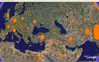
Looks like the Earth is having some sort of disease.... (download KMZ). The volume of the spheres represents the country population (source: UNdata). The sphere model was downloaded from Google 3D Warehouse, and colourised in Google SketchUp. That's the disadvantage of using models for this purpose, - it is not possible to colourise a Collada object in KML in the same way as images loaded as icons. If you want 3D symbols in different colours, you need to create different Collada objects.

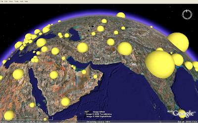
Scaling is a different story, as the x, y and z axis can be scaled independently in KML. I'm using this technique to make the sphere objects population proportional.

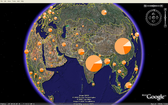
As this image (KMZ) shows, any Collada object can be used... (person from 3D Warehouse).

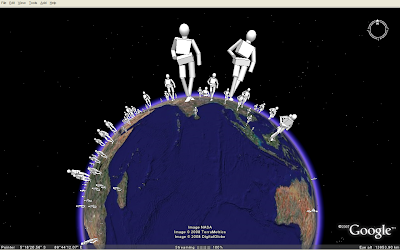
This was the end of my How to make proportional symbols with KML series. Please notice me if you know other techniques, or how these techniques could be enhanced!

Drawing 3D bars in KML

The regular polygons from my last blog post can easily be turned into bars by adding an altitude value for each vertex or corner point of the polygon. The technique is similar to the one I used for choropleth mapping (irregular polygons). In a 3D environment, I find bars or extruded polygons much more efficient than proportional symbols (2D). It is easier to spot how the statistical value changes over the surface. Let's map the digital divide:

On this map (KMZ), the height and colour of the bars represents Internet users per 100 population (source: UNdata). We can clearly see the digital divide in the world. Still, because of all the "small" countries in Europe compared to other parts of the world, it is not a fair picture.

Here, I've added another variable: The bar diameter now represents the population in each country, - and the image tells a slightly different story than the image above (KMZ).

Drawing regular polygons in KML

The second hack for making proportional symbols in KML, is to use regular polygons (see the first hack here and here). Unfortunately, KML has no build-in support for regular polygons so you have to do it the hard way: by calculating the longitude/latitude for each vertex or corner point of the polygon. Since I'm not a math genius, I was happy do find this PHP function by TJ which I could modify for this purpose. This is the result:

By changing the bearing or angle 30 times from 0 to 360, the function returns a circle (KMZ).

Reduce the number of iterations to 4, and you'll get a square (KMZ). Not the easiest way to draw a square, but it works.

These files are also viewable in Google Maps and Microsoft Live Maps (Virtual Earth), even though the circles are not so regular any more.


Monday 28 April 2008

Using Google Charts with KML

In my last post, I showed how KML icon images could be utilised for proportional symbol mapping. Instead of loading a custom image, images can be requested from the URL based Google Chart API as shown below (download KMZ).

These pie charts are generated on-the-fly. The dataset is the same I used for my OpenLayers and Google Chart mashup. The charts are scaled according to total population and the pie shows the age distribution for each country. If you click on a chart, you'll see a larger version in the balloon:

Since the pie charts are loaded from an external service, the KMZ file is only 10 kB. There are some performance issues since around 200 pie charts are requested from the Google Chart API. I hope to see chart functionality as an integral part of KML and various geobrowsers in the future.

The map is also viewable in Google Maps and Microsoft Live Maps (Virtual Earth). The KML IconScale element is not supported by these geobrowsers, so all pie charts have the same size.

You'll obtain more control of the styling by using GeoJSON and OpenLayers.

Sunday 27 April 2008

Making proportional symbols in KML

I would argue that KML and Google Earth supports reference maps (geographic features) much better than thematic maps (spatial patterns of a theme). Still, there are some workarounds, and this week I want to show three different ways of making proportional symbols in KML: icons, regular polygons and collada models.

In this post, I want to focus on how to make proportional circles using the KML Icon element. This is the easiest and most efficient way to make proportional symbols.

This map shows the population in each country of the world in 2005 (source: UNdata). See this blog post for information about symbol placement and how they are mathematically scaled.

A KML icon has to be an image. I hope vector support will be added in the next major KML version. A circle can be drawn using one line of SVG, and I think KML should support such basic shapes. Still, KML has powerful ways of styling icon images, and I've used these elements to create proportional symbols.

I've made one icon for the proportional symbols map. The icon is a white circle on a transparent background saved as a PNG file (200 x 200 px). The icon size has to be bigger than "normal" icons since it will be scaled proportional to an attribute value. The icons are colourised and scaled using IconStyle elements. Only one image is thereby needed to make circle symbols in different colours and sizes. The KMZ file containing KML and the image is only 19 kB.

The drawback is that the map is only viewable in Google Earth (so far). This is how it looks in Google Maps and Microsoft Live Maps (Virtual Earth). The icons are not colourised or scaled.


Sunday 20 April 2008

Google Chart and OpenLayers Mashup

In a previous blog post, I demonstrated the new thematic map feature of the Google Chart API. I was not too impressed with the choropleth map it returned. A greater advantage of this API is the possibility to put charts on top of web maps. I here demonstrate how this can be achieved using OpenLayers.

This map shows the total population and the age distribution in each country of the world in 2005. Instead of proportional circles, I’m here using pie charts to symbolise the population. The chart size is mathematically scaled in direct proportion of the total population. The pie chart itself shows the age distribution as shown in the right figure.

The chart URL’s are generated with JavaScript from parameters stored in a GeoJSON FeatureCollection, and the chart images are loaded using the OpenLayers API. By loading the images into a vector layer (even though it sounds a bit strange), you have access to the new styling capabilities of OpenLayers 2.6.

There are some performance issues since about 200 pie chart images have to be downloaded for each zoom level. Even though Google recently removed the limit on the number of daily requests, I guess they’re not too happy with this way of utilising the API…

Proportional symbol mapping with OpenLayers

This blog post shows how the new release of OpenLayers (2.6) and GeoJSON can be utilised to make proportional symbol maps. The performance is very good compared to choropleth world maps.

This map shows the population in each country of the world in 2005. The population numbers (medium variant) were downloaded from UNdata. For the purpose of symbolisation, these are conceived as conceptual point data. The symbols are placed in the centre of each country, even though the data represents the country as a whole. The population data are provided as a GeoJSON FeatureCollection containing point coordinates (longitude/latitude) and parameters (name and population of country).

Proportional symbols can be geometric or pictographic. I’m using circles on the map above, which have been the most frequently used geometric symbol. Scalable pictographic symbols are harder to create in a web interface. I will try different methods at a later stage.

The size of the circle areas are mathematically scaled in direct proportion of the population data. This is the JavaScript formula:

Math.sqrt(value / maxValue) * maxSize

The maximum symbol size is chosen to minimise the symbol overlap. People tend to underestimate the size of larger symbols, and an alternative to mathematical scaling is perceptual scaling. The underestimation is here taken into account when constructing the formula.

The new 2.6 release of OpenLayers has some powerful styling capabilities. When the user zooms the map, the circles are automatically scaled to keep their relative size. This map shows the effect:

Thanks to the OpenLayers developers and contributors for making a great product!

Reference:
Thematic Cartography and Geographic Visualization, Second Edition 2005, Terry A. Slocum et al., Pearson Education, Inc

Wednesday 2 April 2008

Thematic mapping with GeoJSON

Is GeoJSON a suitable data interchange format for thematic world mapping? The format has a lot of potential, but there are major performance issues due to browser restrictions. I've used OpenLayers to test how choropleth maps can be rendered from GeoJSON encoded data. The map is available on this page (best performance in Firefox).

Directions Magazine has an excellent introduction to GeoJSON. Open source tools like OpenLayers, GDAL/OGR, GeoServer and FeatureServer already supports the GeoJSON draft specification.

On the map above (number of Internet users), all countries are wrapped in a FeatureCollection. Each country is represented by a Feature containing MultiPolygon geometry and parameters. By using GeoJSON you are basically transferring vector data directly to the client instead of map images. This has several advantages:
  • You can do client side processing of the data. One example is reprojecting of the data in the browser.
  • The thematic display classifications or colour range can be changed without interfering the server.
  • Possible to create a richer user interface (i.e. mouseover effects).
  • No need for advanced map server software.
  • Fast. The vector boundaries only needs to be downloaded once in a session.

The bottleneck is the vector rendering in the browser. The map above is rendered using a vector layer in OpenLayers. Depending on your browser, the polygons are rendered using SVG or VML. OpenLayers had great difficulties rendering my original world borders dataset. This dataset consists of 3775 polygons. By deleting "small" islands, I was able to reduce the number of polygons to 463. I have also greatly simplified the country borders, and reduced the number of lat/long decimals to two. The map now loads within a few seconds, even though it's a bit "shaky" in Internet Explorer. It works, but I find the boundaries oversimplified and not very useful.

MapFish contains a GeoStat widget (still in alpha-release) that shows choropleth mapping in OpenLayers. The country borders and indicator values are retrieved as GeoJSON from the server. The colouring of the polygons is done through JavaScript in the web browser. As we see, a good performance can be achieved by only mapping African countries.

Conclusion: GeoJSON has a lot of potential, but is currently not suitable for world maps due to browser restrictions.

UPDATE 6 APRIL 2008: Read follow-up post on Technical Ramblings

Data source for Internet users: UNdata