
In my last post, I showed how KML icon images could be utilised for proportional symbol mapping. Instead of loading a custom image, images can be requested from the URL based Google Chart API as shown below (download KMZ).
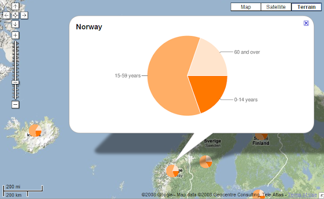
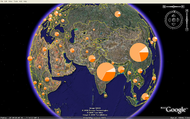 These pie charts are generated on-the-fly. The dataset is the same I used for my OpenLayers and Google Chart mashup. The charts are scaled according to total population and the pie shows the age distribution for each country. If you click on a chart, you'll see a larger version in the balloon:
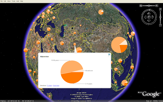 Since the pie charts are loaded from an external service, the KMZ file is only 10 kB. There are some performance issues since around 200 pie charts are requested from the Google Chart API. I hope to see chart functionality as an integral part of KML and various geobrowsers in the future.
The map is also viewable in Google Maps and Microsoft Live Maps (Virtual Earth). The KML IconScale element is not supported by these geobrowsers, so all pie charts have the same size.
 You'll obtain more control of the styling by using GeoJSON and OpenLayers.
These pie charts are generated on-the-fly. The dataset is the same I used for my OpenLayers and Google Chart mashup. The charts are scaled according to total population and the pie shows the age distribution for each country. If you click on a chart, you'll see a larger version in the balloon: Since the pie charts are loaded from an external service, the KMZ file is only 10 kB. There are some performance issues since around 200 pie charts are requested from the Google Chart API. I hope to see chart functionality as an integral part of KML and various geobrowsers in the future.
The map is also viewable in Google Maps and Microsoft Live Maps (Virtual Earth). The KML IconScale element is not supported by these geobrowsers, so all pie charts have the same size.
 You'll obtain more control of the styling by using GeoJSON and OpenLayers.
Comments
M
I was trying to use google charts api with Gearth but when its not showing any charts.I included the chart url in description tag and cannot see any output.Is there any specific way i need to follow while writing kml or creating charts.Could you also please suggest me how to make charts on the fly(i.e server side)
Thank you,
If you download the KMZ file in this blog post, you can right-click on an element in the places panel in Google Earth, select 'copy' and paste the code into a text editor. You'll then see how the chart images are referenced in KML.
To generate charts on the server you could use a graphics library like gd (complicated), or generate URLs for the Google Chart API (not so complicated). Details are explained in the Thematic Mapping Engine documentation (click on Downloads above).
The problem is with labels in google chart URLs, for some reason the vertical bar separator makes the URL unusable. I've just tried your KMZ file with GE 4.3.7284.3916 - I have proper images for placemarks, but in the description only gray rectangles remain. If I remove labeling (legeng) from URL to google charts the image appears. Any ideas how to solve it?
But I really respect what you were able to achieve with respect to the API.
I just have , say excel file with latitude , longitude and the data to be indicated on pie chart.
what kind of software can I use to gwenerate kmz / kml ?
nice article. I have found another sample code about How to create Chart on Google Maps - Google Visualization. Please visit http://www.etechpulse.com/2013/07/how-to-create-chart-on-google-maps.html
I hope this will be helpful.