
Thematic Mapping Engine (TME) is now supporting proportional symbols and choropleths in addition to prism maps. Three different types of proportional symbols are supported:
1. Images
By selecting this option, you can choose between two images (so far) which are scaled according to a statistical value. This blog posts explains how this is achieved.
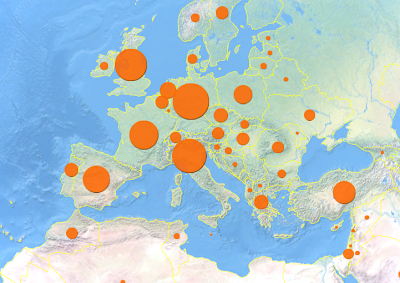 This map shows number of mobile telephone subscribers in 2003.
 Same indicator, but with different image shape and colour.
If you compare the result in the Google Earth browser plugin with the desktop program, you'll see a noticeable difference: The icons are much bigger in the plugin. The reason is different viewport sizes, and I consider this to be a Google Earth bug. I'm probably using the KML Icon element in a way that was not intended. Look at these images which are from the same KML file:
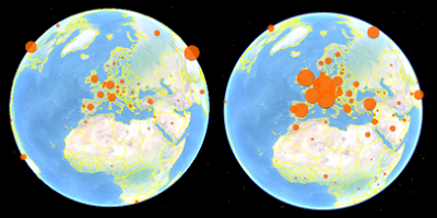 There are two different ways adjusting the size of the planet in Google Earth. The left visualisation shows the earth in a zoomed out view. The circle images are scaled properly. You can also change the size of the planet by adjusting the Google Earth window. The problem is that the circle images maintains their size while the planet shrinks or expands.
Still, this option works quite well if you have a fixed viewport for Google Earth.
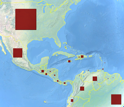
2. Regular polygons
The second option is to draw regular polygons as KML features. Unfortunately, KML has no build-in support for regular polygons, so these polygons have to created by complex calculations. Luckily, this is hidden behind the scenes of the Thematic Mapping Engine.
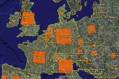 The result is not nice looking in Google Earth. The satellite imagery distracts the view, and the borders are placed on top of the polygons. Other KML renderers might do a better job. It's also impossible to make perfect geometric shapes with this technique.
3. Collada objects
The last option is to use 3d Collada objects. These visualisations might be eye candy, but I'm not sure how effective they are in conveying geographical patterns. There are also some scaling issues which I'll write about later.
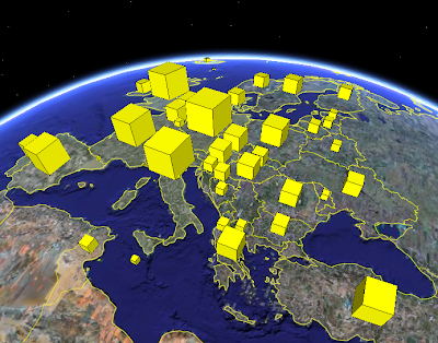 A 3d variation of mobile telephone subscribers in 2003.
Choropleths
I've also added choropleths as an alternative to prism maps.
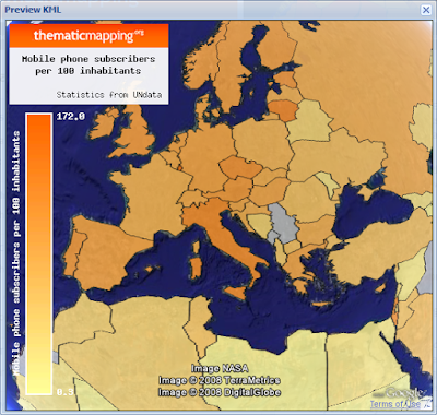 The country polygons are shaded according to the number of mobile phone subscribers per 100 inhabitants.
You can try the Thematic Mapping Engine here. Please provide your feedback!
All statistics from UNdata.
1. Images
By selecting this option, you can choose between two images (so far) which are scaled according to a statistical value. This blog posts explains how this is achieved.
 This map shows number of mobile telephone subscribers in 2003.
 Same indicator, but with different image shape and colour.
If you compare the result in the Google Earth browser plugin with the desktop program, you'll see a noticeable difference: The icons are much bigger in the plugin. The reason is different viewport sizes, and I consider this to be a Google Earth bug. I'm probably using the KML Icon element in a way that was not intended. Look at these images which are from the same KML file:
 There are two different ways adjusting the size of the planet in Google Earth. The left visualisation shows the earth in a zoomed out view. The circle images are scaled properly. You can also change the size of the planet by adjusting the Google Earth window. The problem is that the circle images maintains their size while the planet shrinks or expands.
Still, this option works quite well if you have a fixed viewport for Google Earth.
2. Regular polygons
The second option is to draw regular polygons as KML features. Unfortunately, KML has no build-in support for regular polygons, so these polygons have to created by complex calculations. Luckily, this is hidden behind the scenes of the Thematic Mapping Engine.
 The result is not nice looking in Google Earth. The satellite imagery distracts the view, and the borders are placed on top of the polygons. Other KML renderers might do a better job. It's also impossible to make perfect geometric shapes with this technique.
3. Collada objects
The last option is to use 3d Collada objects. These visualisations might be eye candy, but I'm not sure how effective they are in conveying geographical patterns. There are also some scaling issues which I'll write about later.
 A 3d variation of mobile telephone subscribers in 2003.
Choropleths
I've also added choropleths as an alternative to prism maps.
 The country polygons are shaded according to the number of mobile phone subscribers per 100 inhabitants.
You can try the Thematic Mapping Engine here. Please provide your feedback!
All statistics from UNdata.
Comments