Monday 23 June 2008

Proportional symbols in three dimensions

Since I'm making my own Thematic Mapping Engine, I need to understand the math behind proportional symbol calculations. Originally, I thought I would need different equations for different geometric shapes, and my book in cartography gave me the same impression. But after reading this article, I realised that life was not that complicated.

This tutorial is a summary of a discussion on the CartoTalk forum. I especially want to thank Dominik Mikiewicz (mika) for his valuable comments and figures. The CartoTalk forum is highly recommended!

Equations for 1D, 2D and 3D proportional symbols:

1-dimensional symbols (height)
This is how the height of bars or prisms is calculated in TME.

Equation: symbolSize = (value / maxValue) * maxSize
PHP: $symbolSize = ($value / $maxValue) * $maxSize
JavaScript: symbolSize = (value / maxValue) * maxSize

Bars or prisms show “real” values scaled down to fit on a map, and you can easily see the relations and which is higher than the other. I’m not considering the problems caused by perspective and the curvature of the earth.

2-dimensional symbols (area)
This is how proportional images and regular polygons (e.g. circle, square) are scaled in TME.

Equation: symbolSize = power(value/maxValue; 1/2) * maxSize
PHP: $symbolSize = pow($value/$maxValue, 1/2) * $maxSize
JavaScript: symbolSize = Math.pow(value/maxValue, 1/2) * maxSize

2D symbols use areas as mean of expression and therefore you're dealing with a square root of a showed value. This makes it relatively difficult to assess a value.

3-dimensional symbols (volume)
This is how 3D Collada objects (e.g. cube, sphere) are scaled in TME.

Equation: symbolSize = power(value/maxValue; 1/3) * maxSize
PHP: $symbolSize = pow($value/$maxValue, 1/3) * $maxSize
JavaScript: symbolSize = Math.pow(value/maxValue, 1/3) * maxSize

3D objects use volumes as mean of expression so you’re showing a cube root of the value. This makes it difficult to assess a value.


It’s important to know that it’s one degree harder for the viewer to assess the relative size of 3-dimensional symbols compared to 3-dimensional, which again is harder to compare to 1-dimensional. This is clearly visualised on this figure (credit: Dominik Mikiewicz):

The figure compares the circle and sphere radius for the same values.

These three images shows GDP per capita (2006, UNdata) using bars (1D), circles (2D) and spheres (3D).


A colour scale and legend helps the user in assessing and comparing symbols.

The visual appearance of 2D and 3D symbols can also be improved by using a perceptual or logarithmic scale.

Saturday 21 June 2008

What a colourful world

3D thematic mapping can be challenging, and I've been considering some of the problematic issues in a series of blog post (1, 2, 3, 4). There has also been a discussion on the CartoTalk forum, and Rich Treves posted a response on his blog.

I released a new version of the Thematic Mapping Engine today as a response to this discussion. The most noticeable new feature is the enhanced colour scale. It's difficult to make a symbol legend in KML, as symbol size varies with scale (zoom). Without a legend, it's very hard to assess the exact values.

This is why I duplicate symbology by supporting a colour legend. You can now easily define a colour scale for all thematic mapping techniques. The colour legend informs the user about the range of values (min and max), and where the different symbols are positioned on this range.

The colour scale can be unclassed or classed:

  • Equal intervals: Each colour class occupies an equal interval along the value range.

  • Quantiles: The countries are rank-ordered and equal number of countries are placed in each colour class. Quantiles are not available for time series.

Here is a few examples (all statistics from UNdata):


Life expectancy at birth, 2005 (equal intervals).


Life expectancy at birth, 2005 (quantiles).


Aids estimated deaths, aged 0-49, 2005 (equal intervals).


Eye candy: Mobile phone subscribers, 2004 (unclassed).

Try it yourself!

Thursday 19 June 2008

Animating mobile phone subscribers...

Ok, this is probably in the "how to sacrifice accuracy for eye candy" category, but it's still fun! Here is Mobile phone subsribers (statistics from UNdata) visualised using a proportional 3D mobile phone:

Mobile phone subscribers in 2003 (download KMZ). 3D phone from Mikeyjm/3D Warehouse. I'm using volume as the scaled parameter, which I think is more accurate than using area or height.

You can even change the colour of the cover... :-o

Animated version (1980-2004):


Download KMZ (NB! You need a quick computer!)

I've added a 3D mobile phone and a 3D person (both from 3D Warehouse) to the Thematic Mapping Engine, so you can make this visualisation yourself.

Tuesday 17 June 2008

Why 3D is not working #4: Am I sacrificing accuracy for eye candy?

The last issue I want to address in my 3D series is the problems of perspective. I find this issue particulary challenging.

“Same with estimating sizes of oblique-viewed 3D domes for proportional symbols. The problem is further magnified when the data is re-projected to an Earth globe view making the task of estimating heights/sizes of the polygons even harder (since the user has to mentally compensate for the curvature of the earth). In short their concern is we are sacrificing accuracy for eye candy.” (Sean Gorman)

Yes, the use of proportional symbols on a 3D globe raises some serious questions. Here are my 3D Collada domes of world population:

Download KMZ.

At least, the dome shape makes it possible to calculate the volume of each object, as the volume should represent the statistical value. I'm not sure how to scale irregular objects properly, - like a 3D person.

The main issue, as stated by Sean above, is how the user are going to estimate the volume of the domes when seen in perspective. The size of the domes are determined by two factors: the size of the population and the "distance" from the point of view. This makes it hard to compare 3D objects.

One solution is to use a non-perspective projection (orthogonal projection) which makes it easier to make cross-scene comparsions (Shepherd, 2008). Using proportional images with the KML Icon element might be an option.

Download KMZ. These symbols keep their relative size when you spin the globe. But what if the user expects the symbols to be scaled as the domes? If I overlay the two symbols it looks like this:

The result is clearly different from a viewer's perspective! Is it possible to do proportional symbol mapping accurately on a 3D globe, or should it be avoided? I'm not sure.
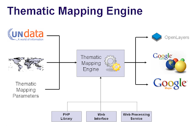

Reference:
Shepherd, I. D. H., 2008, “Travails in the Third Dimension: A Critical Evaluation of Three-dimensional Geographical Visualization”. Book chapter in "Geographic Visualization: Concepts, Tools Applications".

Why 3D works #3: Mother Earth gives us a clue

Since I'm on a 3D choropleth jag, I want to address two common problems with prism maps; blocking and lack of north orientation.

“Its possible that a high oil consumption of one country would obscure (or at least complicate the view if the 3D models are translucent) the consumption of a country located behind it, meaning I have to 'fly' around to see the value related to that country.” (Rich Treves)

I agree with this statement, even though it's possible to guide the user in various ways:

In my first and second blog post in this 3D series, I explained why I'm using two visual variables (colour and height) to represent the same statistical indicator. This is another good reason; colour might help the user in identifying hidden prisms.

This prism map is created with the Thematic Mapping Engine, and shows life expectancy at birth (both sexes) in 2005. I'm not using a colour scale to represent the statistical value. The prism representing the low life expextancy in Afghanistan is hidden behind Pakistan.

If you look at the prisms from above, the "shadows" helps you to identify the lower life expectancy in Afghanistan, but it's hard to measure the relative height.

By adding a colour scale, it's easier to see that Afghanistan is experiencing lower life expectancy than the neighbouring countries. This is a suggested solution by Slocum (2005/70).

“You are being redundant though by using color and prism height to show the same variable. It might be more interesting (and complicated!) to use the height to show something else to compare to internet usage.” (Cory Eicher)

Not everyone likes this approach. Two different visual variables (colour and height) might also mean two different statistical indicators. I think it would be more confusing to combine two indicators on a prism map like this. I would appreciate more feedback about how people precieve prism maps using both height and colour for the same statistical indicator.

I agree with Cory that combining two indicators might be more interesting (depending on what you are looking for), but I think another approach could be used with greater success. I'll return to bivariate mapping later.

A reason why KML is good for thematic mapping is the FlyToView, Camera and LookAt elements. By using these elements we can automatically fly the user to the best "prism viewing location" (not so easy with whole world visualisations...), or to the location where we want to draw the attention. This might create another problem, as rotation and perspective might produces a view that is unfamiliar to users who normally see maps with north at the top (Slocum et al., 2005). This is a bigger challenge for paper-based prism maps than digital ones, since the user can switch easily between different scales to restore geographical orientation.

Still, we're here at a key point: 3D visualisations tend to impose severe interaction demands on users (Shepherd, 2008/201). This can also be beneficial, as the user might learn and see more in interactive and explorative environments.

References:
Slocum, T. A, 2005, "Thematic Cartography and Geographic Visualization", Second Edition, Pearson Education, Inc

Shepherd, I. D. H, 2008, “Travails in the Third Dimension: A critical Evaluation of Three-dimensional Geographic Visualization.” Book chapter in Dodge, M., McDerby, M. and Turner, M., 2008, “Geographic Visualization: Concepts, Tools and Applications”, Wiley.

Monday 16 June 2008

Why 3D works #2: It’s all about prisms

It’s seems like people have a love/hate relationship with prism maps. Here are some of the arguments in the “don’t like” category together with my counter-arguments:

“IMHO creating coropleth maps using prisms is not really *efficient* (but of course it’s spectacular) because it’s really hard (at least for me, maybe I’m too “plain”) to realize slight differences between non-contiguous areas. In fact you are using to techniques to present the same variable, color and prism height. As I see, the classic way to present a quantitative variable using the amount of brightness and just one value (color) is more efficient independently of using a 2D or a 3D environment.” (XuRxO)

“If I wanted to find out the exact value of oil consumption for a particular country on the thematic map I can easily glance at the colors in the key to pinpoint the value. With consumption converted to height in Google Earth its difficult to read off the actual value.” (Rich Treves)

“I was talking to some cartographer friends about the recent proliferation of 3D thematic maps and they had some concerns about their utility and accuracy. Specifically they pointed to testing that has shown people stink at estimating heights of the countries and have the hardest time telling the most basic differences in height.” (Sean Gorman)

I’ll stick to the “Infant Mortality Rate” visualisation introduced in my last blog post:

Prism map (download KMZ).

Choropleth map (download KMZ).

The best solution is to select a visual variable that match the level of measurements (nominal, ordinal or numerical) of the data (Slocum et al., 2005). Hue (colour) is the best way to represent nominal data, ordered hues (e.g. yellow, orange, red) or lightness are the best ways to represent ordinal data, while perspective height (prism) is the best way to represent numerical data (page 72). Clearly, brightness/hue is not the only "classic way" of representing numerical data.

The reason why perspective height gets the highest rank by Slocum (2005/70) is that an unclassed prism map will portray ratios correctly, since a value twice as large as another will be represented by a prism twice as high. Slocum also identifies two problems of prism maps; that tall prisms sometimes block smaller prisms and that rotation might produce a view that is unfamilar to users. This is the topic of my next blog post in this series.

If you look at the two images above (or in Google Earth) I will argue that the prism map is able to convey more detail than the choropleth map. I find it easier to see how the infant mortality rate varies across the continent, and to compare countries adjacent to each other.

I agree with Rich that a colour legend helps the user to pinpoint a value, even though it's impossible to identify the exact value by this method. A height legend is diffult to make since the scale is changing. Still, I think legends are more important for paper maps than digital maps. On a digital map you should always be able to obtain the value by clicking a feature.

In Google Earth, a Point Placemark is the only object you can click or roll over. You can click on a polygon by holding down the shift-key, but this is not very user friendly. Collada objects are not clickable at all. Google, I wont sleep well until this is fixed ;-)

In conclusion, - try a prism map if you deal with numerical data and have 3D at your disposal!

References:
Thematic Cartography and Geographic Visualization, Second Edition 2005, Terry A. Slocum et al., Pearson Education, Inc

Why 3D works #1: Looking on the other side

I appreciate all the feedback I’ve got in emails, on this blog and on other blogs. Especially, I’m thankful for critical feedback as this is helping me in addressing important issues. Most of the critical comments are questioning the effectiveness of 3d globe visualisations, which are widely used on this blog.

We definitely need to think critically about the pros and cons of 3D visualisations. I want to give my response in a series of blog posts.

Rich Treves made a comment where he linked to his blog post “3D Rears its Ugly Head Again”. This is the first of his three arguments against 3D KML (Rich, excuse me for taking your arguments out of context!):

“I can't compare the Oil consumption of UK and Australia at the same time because they are on different sides of the globe.”

True, the ability to compare all countries is lost when thematic maps are rendered on a globe. Still there are various ways to address this issue:

1. I’m using two visual variables (colour and height) to represent the same statistical indicator. This makes country comparison easier when spinning the globe.

I could not find oil consumption statistics at UNdata, so I'm using "Infant Mortality Rate" instead (per 1,000 live births). You can make the map in the Thematic Mapping Engine, or download the KMZ file here. I think this is a good and effective 3D visualisation.

2. Values can be displayed on the globe, which makes country comparisons much more accurate.

I added this feature to the Thematic Mapping Engine yesterday. More info will come in a separate blog post.

3. Another option, which is now possible with the new Google Earth plugin, is to have two spinning globes in the same window.

Click here for a live example (based on the China Syndrome example from Google Code). If you rotate the left globe, the right globe will show you the view on the other side. I think it would be better to enable the user to rotate the two globes indepentantly.

4. A different approach is leave the globe, but hold on to 3D KML using a tool like UUorld, where you have 3D prisms on a flat world map.

Currently, there are no 3D KML renderers that are able to make such visualisations, but I’m sure there will be in the near future. Maybe a job for the UUorld guys? UUorld seems to use Plate Carrée (Equidistant cylindrical) projection. This is clearly not the best choice for thematic world maps, but it’s the same projection currently supported by KML (EPSG:4326).

In conclusion, country comparisons are problematic on a 3D globe, but it shouldn’t stop us from doing it!

Tuesday 10 June 2008

Proportional symbols in Thematic Mapping Engine

Thematic Mapping Engine (TME) is now supporting proportional symbols and choropleths in addition to prism maps. Three different types of proportional symbols are supported:

1. Images
By selecting this option, you can choose between two images (so far) which are scaled according to a statistical value. This blog posts explains how this is achieved.

This map shows number of mobile telephone subscribers in 2003.

Same indicator, but with different image shape and colour.

If you compare the result in the Google Earth browser plugin with the desktop program, you'll see a noticeable difference: The icons are much bigger in the plugin. The reason is different viewport sizes, and I consider this to be a Google Earth bug. I'm probably using the KML Icon element in a way that was not intended. Look at these images which are from the same KML file:

There are two different ways adjusting the size of the planet in Google Earth. The left visualisation shows the earth in a zoomed out view. The circle images are scaled properly. You can also change the size of the planet by adjusting the Google Earth window. The problem is that the circle images maintains their size while the planet shrinks or expands.

Still, this option works quite well if you have a fixed viewport for Google Earth.

2. Regular polygons
The second option is to draw regular polygons as KML features. Unfortunately, KML has no build-in support for regular polygons, so these polygons have to created by complex calculations. Luckily, this is hidden behind the scenes of the Thematic Mapping Engine.

The result is not nice looking in Google Earth. The satellite imagery distracts the view, and the borders are placed on top of the polygons. Other KML renderers might do a better job. It's also impossible to make perfect geometric shapes with this technique.

3. Collada objects
The last option is to use 3d Collada objects. These visualisations might be eye candy, but I'm not sure how effective they are in conveying geographical patterns. There are also some scaling issues which I'll write about later.

A 3d variation of mobile telephone subscribers in 2003.

Choropleths
I've also added choropleths as an alternative to prism maps.

The country polygons are shaded according to the number of mobile phone subscribers per 100 inhabitants.

You can try the Thematic Mapping Engine here. Please provide your feedback!

All statistics from UNdata.

Thursday 5 June 2008

Thematic mapping and the Google Earth plugin

Thanks for all the feedback after my initial release of Thematic Mapping Engine. Two features have been requested; data upload/import and support for the new Google Earth plugin. I've now added a Preview-button, which enables you to see thematic maps in the browser instead of switching between two applications.

The Google Earth plugin seems to render big and complex KML files very well. The image above shows GDP per capita in 2005.

A missing feature is support for KML time primitives. The TimeSpan and TimeStamp elements are not supported, and the plugin renders all the polygon features regardless of the time specified (above image). This will hopefully be fixed in a future release.

With the new Google Earth plugin it's possible to create a highly interactive and explorative user interface for geovisualisation. The plugin can be combined with other visualisation gadgets in a way that is not possible in Google Earth. As applications move from the desktop to the web, there will be a great demand for JavaScript experts who know how various APIs and libraries can be combined.

By the way, Thematic Mapping Engine still works without the Google Earth plugin - just click the Download-button.

Sunday 1 June 2008

Thematic Mapping Engine

It's time to introduce the Thematic Mapping Engine (TME). In my previous blog posts, I've shown various techniques of how geobrowsers can be used for thematic mapping. The goal has been to explore the possibilites and to make these techniques available to a wider audience. The Tematic Mapping Engine provides an easy-to-use web interface where you can create visually appealing maps on-the-fly.

So far only prism maps are supported, but other thematic mapping techniques will be added in the upcoming weeks. The engine returns a KMZ file that you can open in Google Earth or download to your computer. My primary data source is UNdata.

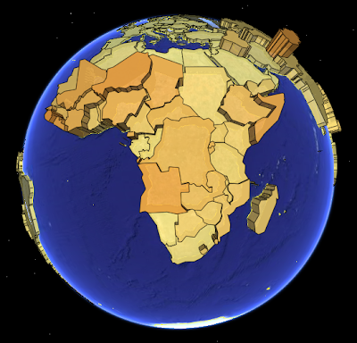
The above visualisation is generated by TME (
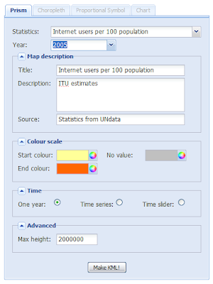
download KMZ) and shows child mortaility in the world (UNdata).

The Thematic Mapping Engine is also an example of what you can achieve with open source tools and datasets in the public domain:


Try Thematic Mapping Engine

Please give your feedback by posting a comment below!

KMZ files on-the-fly with PHP ZIP extension

When I'm creating thematic maps with KML, I often end up with a series of files; legend images, icon images, 3D Collada objects and the KML file itself. The KML file is often large because of complex geometries repeated for several time steps. Fortunately, KML files and linked images and 3D objects can be zipped into one KMZ archive, which make file transfer easier and more efficient.

I'm using the PHP ZIP extension to create KMZ files on-the-fly. Basically, a KMZ file has the same properties as a ZIP file. With the PHP extension you can open a new KMZ archive and add your KML code (named "doc.kml") and images/3D objects that are linked with the href element.

For my last blog post, I created a KMZ archive (download) containing one KML file, one folder and three images. The original files are 1,418 kB in total while the KMZ file is only 153 kB - a lot of bandwidth saved!

Links