 (The population prism map is from Edmar Moretti's Brazilian version of the Thematic Mapping Engine. The highest prism is São Paulo, with its metropolitan area ranking seventh among the largest urban areas in the world.)
Friday, 19 December 2008
Merry Christmas and Happy New Year!
I need a vacation from blogging and computers, so I'm going to take one. Have a great Christmas and a Happy New Year! I'll be back in 2009.
 (The population prism map is from Edmar Moretti's Brazilian version of the Thematic Mapping Engine. The highest prism is São Paulo, with its metropolitan area ranking seventh among the largest urban areas in the world.)
(The population prism map is from Edmar Moretti's Brazilian version of the Thematic Mapping Engine. The highest prism is São Paulo, with its metropolitan area ranking seventh among the largest urban areas in the world.)
Monday, 15 December 2008
Michael Jones, Google Earth Chief Technologist, in live webcast at AGU Fall meeting today
 The lecture is titled The Spread of Scientific Knowledge from the Royal Society to Google Earth and Beyond and will be given at 6:30 pm San Francisco time.
 Watch AGU webcast
Saturday, 13 December 2008
Thematic mapping at Googleplex
After I handed in my MSc thesis in August, Google invited me to San Francisco to present my work. Yesterday, I gave a tech talk at Googleplex about the Thematic Mapping Engine (now open-source) and how KML and Google Earth could be improved to better support popular thematic mapping techniques. My slides are available on SlideShare.
My talk was filmed and will probably appear online. I was a bit nervous during the presentation, so its not my best performance :-&
Anyway, I really enjoyed the discussions with the geo developers, the lunch talks, and the guided tour around Googleplex. Thanks Google!

My talk was filmed and will probably appear online. I was a bit nervous during the presentation, so its not my best performance :-&
Anyway, I really enjoyed the discussions with the geo developers, the lunch talks, and the guided tour around Googleplex. Thanks Google!

The next event is the AGU 2008 Fall Meeting starting on Monday. I'm an invited speaker at the Virtual Globes at AGU session on Thursday.
Monday, 8 December 2008
Thematic Mapping Engine: Source code and technical documentation now available
Many people have asked, - and today, I've released the source code of the Thematic Mapping Engine (TME) under a GPLv3 license. The engine takes statistical data, spatial features and thematic mapping parameters as input and returns a KMZ file. This file can be viewed in Google Earth, or other geobrowsers supporting the KML standard. TME can be accessed from a web interface or a PHP script.
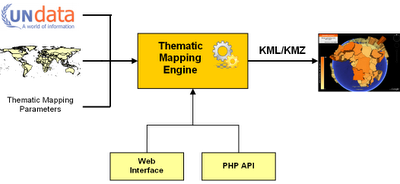
TME web interface
With the TME web interface, thematic maps can be created in a web browser, without a single line of code. This is achieved through an interactive web form where the user can select between statistical indicators and various thematic mapping techniques. Mapping parameters, like the colour and size, can be readily changed. The form returns a KMZ file which can be visualised directly in the web browser using the new Google Earth plug-in, or downloaded to a computer.
TME Application Programming Interface (API)
The Thematic Mapping Engine can also be used as an application programming interface (API). This allows thematic maps to be created with a few lines of PHP code. Existing or new applications can use this API to add thematic mapping functionality. This is the code required to create a choropleth map:
Requirements
The Thematic Mapping Engine requires the following software (all are open source and available free of charge):
This PDF document (7 Mb) gives a detailed description of the Thematic Mapping Engine. The documentation is available under a Creatice Commons Attribution-Share Alike License 3.0.
You should have a basic knowledge of PHP, MySQL and JavaScript before installing the Thematic Mapping Engine.
Download the TME source code on Google Code.
Enjoy!

TME web interface
With the TME web interface, thematic maps can be created in a web browser, without a single line of code. This is achieved through an interactive web form where the user can select between statistical indicators and various thematic mapping techniques. Mapping parameters, like the colour and size, can be readily changed. The form returns a KMZ file which can be visualised directly in the web browser using the new Google Earth plug-in, or downloaded to a computer.
TME Application Programming Interface (API)
The Thematic Mapping Engine can also be used as an application programming interface (API). This allows thematic maps to be created with a few lines of PHP code. Existing or new applications can use this API to add thematic mapping functionality. This is the code required to create a choropleth map:
include ('TME_MySQL_DataConnector.php');
include ('TME_Engine.php');
$dataConnector = new DataConnector();
$dataStore = $dataConnector->getDataStore(68, 2005, 0);
$parameters = array(
'mapType' => 'choropleth',
'indicator' => 68,
'year' => 2005,
'classification' => 'equal');
$map = new ThematicMap($dataStore, $parameters);
$file = $map->getKML();
Requirements
The Thematic Mapping Engine requires the following software (all are open source and available free of charge):
- PHP 5
- MySQL 5+
- Apache HTTP Server
- Ext JS 2.1
- Google Earth Plug-in
This PDF document (7 Mb) gives a detailed description of the Thematic Mapping Engine. The documentation is available under a Creatice Commons Attribution-Share Alike License 3.0.
You should have a basic knowledge of PHP, MySQL and JavaScript before installing the Thematic Mapping Engine.
Download the TME source code on Google Code.
Enjoy!
Sunday, 7 December 2008
Thematic mapping techniques - a summary
Thematic maps have become a primary mechanism for summarising and communicating the increased volumes of geographically related information. This blog post is a short summary of the most common thematic mapping techniques.
Jaques Bertin (1967) established a graphic system of visual variables, which represents an universally recognized theory of the cartographic transcription of geographical information (Koch, 2001). Visual variables describe the perceived differences in map symbols that are used to represent geographical phenomena (Slocum et al., 2005). Bertin’s system has been subsequently modified by various cartographers, and the visual variables presented below are based on Slocum et al. (2007), which add 3-D symbolisation.
 (Image from InfoVis:Wiki)
Cartographers commonly distinguish between point, line, area and volume symbolisation (Robinson et al., 1995; Slocum et al., 2005). These distinctions may be summarised as follows:
A point symbol refer to a particular location in space, and is used when the geographical phenomena being mapped is located at a place or is aggregated to a given location (MacEachren, 1979). Differentiation among point symbols is achieved by using visual variables, like size, colour and shape. Common thematic mapping techniques using point symbols are dot maps and proportional symbol maps. On a dot map one dot represents a unit of some phenomena, and dots are placed at locations where the phenomenon is likely to occur (Slocum et al., 2005). A proportional symbol map is constructed by scaling symbols in proportion to the magnitude of data occurring at point locations. These locations can be true points or conceptual points, such as the centre of a country for which the data have been collected.
Line symbols are used to indicate connectivity or flow, equal values along a line and boundaries between unlike areas (MacEachren, 1979). Line symbols are differentiated on the basis of their form (e.g. solid line versus dotted line), colour and width. Common thematic mapping techniques using line symbols are flow maps and isarithmic maps. Flow maps utilise lines of differing width to depict the movement of phenomena between geographical locations (Slocum et al., 2005). Isarithmic maps depict smooth continuous phenomena, like rainfall or barometric pressure (Slocum etal., 2005).
Area symbols are used to assign a characteristic or value to a whole area on a map. Visual variables used for area symbols are colour, texture and perspective height (Slocum et al., 2005). The choropleth map is probably the most commonly employed method of thematic mapping, and is used to portray data collected for enumeration units, such as countries or statistical reporting units. While choropleth maps reflect the structure of data collection units, dasymetric maps assume areas of relative homogeneity, separated by zones of abrupt change. The country statistics used in the Thematic Mapping Engine can be considered as areal phenomena, because the statistical values are associated with political units specified as enclosed regions.
Volume symbols can be considered as 2½-D or true 3-D (Slocum et al. 2005). The first can be thought of as a surface, in which a geographical location is defined by x and y coordinate pairs and the value of the phenomenon is the height above a zero point. An example is prism maps which uses perspective height as the visual variable. 3-D symbols can be used to represent true 3-D phenomena, like the concentration of carbon dioxide (CO2) in the atmosphere or geological material underneath the earth’s surface (Slocum et al., 2005).
I'm interested in how these techniques can be represented in KML. You'll find several examples on this site. Please provide other examples by adding a comment. Especially, I would like to see examples of dot maps, flow maps, isarithmic maps and dasymetric maps in KML.
References:
- Bertin, J., 1967, "Semiologie Graphique", Paris
- Koch, W. G., 2001, "Jaques Bertin’s theory of graphics and its development and influence onmultimedia cartography", Information Design Journal 10(1), pp 37-43, John BenjaminPublishing Company
- MacEachren, A. M., 1979, "The Evolution of Thematic Cartography / A Research Methodology and Historical Review", The Canadion Cartographer Vol 16, No 1 June 1979, pp 17-33
- Robinson, A. H., Morrison, J.L., Muehrcke, P.C., Kimerling, A. J., Guptill, S. C., 1995, "Elements of Cartography", Sixth Edition, John Wiley & Sons
- Slocum, T. A., McMaster, R. B., Kessler, F. C., Howard, H. H., 2005, "Thematic Cartography and Geographic Visualization", Second Edition, Person Education Inc.
Saturday, 15 November 2008
New Ext JS extension for Google Earth API

I've made a new Ext JS extension for Google Earth API available on Google Code.
- Example (code)
- Documentation
- Download (version 1.1)
Enjoy! :-)
Tuesday, 11 November 2008
Visualizing Scientific Data Using KML and Virtual Globes

The 2008 American Geophysical Union (AGU) 2008 Fall Meeting will take place 15-19 December in San Francisco. The topic of this year's Virtual Globes at AGU session is Visualizing Scientific Data Using KML and Virtual Globes:
Since NASA World Wind (2004) and Google Earth (2005) brought the concept of a Virtual Globe into the general public's consciousness, our concept of how to view the planet we live on has permanently changed. Similar to the way the internet changed the way we store, access and sort information, Virtual Globes are reshaping our perspective of how best to visualize geospatial data. One the key components of this evolution has been emergence of Keyhole MarkUp Language (KML) as the preferred code for adding and controlling content in these technologies. Now recognized by the Open Geospatial Consortium (OGC) as an international standard, KML is now increasingly supported by a range of platforms, including Google Earth and Maps, NASA World Wind, ESRI ArcGIS Explorer and Microsoft's Virtual Earth and EarthBrowser.
The Virtual Globes at AGU session seeks to provide a forum for users to exchange ideas, promote concepts and demonstrate innovations using KML and/or globe and other geobrowser technologies.
It's an action packed day (Thursday 18th December) with lots of interesting talks and interactive demonstrations. I'm invited to give a talk about Using KML for Thematic Mapping and the Thematic Mapping Engine.
I would like to use this opportunity to catch up with other practitioners in this field and exchange ideas. I will stay in San Francisco 11-19 December. Please send me a note if you are around.
Monday, 10 November 2008
Globalis and the Google Earth Plug-in
Globalis is an interactive world atlas developed by UN Association of Norway. The atlas contains a large collection of international statistics, world maps (provided by GRID-Arendal), satellite imagery, country profiles and information about ongoing conflicts around the world. It is possible to do country comparsions (example 1, example 2), country rankings, and statistical maps. The atlas is currently available in Norwegian, Swedish and Danish.

We are going to make most of this information available as KML files. So far you can download various KMLs to Google Earth. We are not satisfied with this solution as the KML specification has limited capabilities of controlling the Google Earth interface, and the user has to switch between two applications. I'm therefore trying to utilise the new Google Earth Plug-in.

This example, based on the Earth Atlas, shows how the Google Earth Plug-in can be included in the Globalis interface. The user can switch between 5 different KMLs about cluster munitions. The map legend and description are shown separately from the KML visualisation.
A missing feature is an indicator showing that a KML file is loading.
Monday, 13 October 2008
Earth Atlas: Creating a KML tree with Ext JS
A new version of Earth Atlas is now available (earthatlas.info). Earth Atlas demonstrates how a Google Earth-like user interface can be created in the web browser. This is achieved by combining the Google Earth API and the Ext JS library. Earth Atlas has no server-side dependencies, - the data layers are provided by loading various KML files.  The main changes since the initial release:
The main changes since the initial release:- The layers available in the Google Earth Plug-in (borders, roads, buildings and terrain) can be switched on and off.
- Various options can be set (status bar, grid, overview map, scale legend, atmosphere and mouse navigation)
- The KML structure (list view) is displayed in the left panel when external files are referenced (see example).
Thursday, 2 October 2008
Introducing Earth Atlas
Earth Atlas is a prototype web application showing how KML files can be visualised directly in the web browser.

The Google Earth API and the Ext JS library are used to create a responsive user interface. Earth Atlas contains KML files from the Thematic Mapping Engine, a few KML SuperOverlays as alternate background maps, and KML files from external sources.
Other KML/KMZ files can be visualised by adding a link in the left panel, or directly in the Earth Atlas URL:
http://earthatlas.info/?kml=http://www.nature.com/nature/googleearth/avianflu1.kml
First release today - to be continued!
Wednesday, 24 September 2008
Displaying KML/KMZ files in Google Maps
KML/KMZ files can be overlaid on Google Maps, either on the Google Maps website, or by using the GGeoXML class of the Google Maps API (see example).
 Google Maps
 Google Maps API
 Google Earth
The KMZ file (download) displayed above was generated by the Thematic Mapping Engine. Only a subset of the KML standard is so far supported by Google Maps. The shaded plygons are properly displayed, but not the screen overlays (title and legend) and balloons. The different placement of the zoom bar in Google Maps and Google Earth makes it difficult to display the same KML/KMZ file in multiple viewers.
I'm impressed by the speed of Google Maps. The above KMZ file contains complex geometries of almost 200 countries of the world. Web browsers are not optimized for vector graphics, as illustrated on this page. To avoid this problem, Google seems to use its powerful servers to generate image map tiles on-the-fly from the KML geometries.
A bug in the map tile generator was discovered when displaying the World Borders dataset in Google Maps:

The polygon representing Russia is not displayed properly. The country is crossing the antimeridian at 180° longitude. To avoid a round trip of the Earth, the eastmost part of Russia is stored as a separate polygon. Russia is not displayed properly because 180° longitude is rendered as 0° longitude (the Prime Meridian). The problem was fixed by replacing all 180 coordinate values width 179.99. I won't correct this in the World Borders dataset, as I consider this to be a bug in Google Maps. If you don't want to change the orginal dataset, you can replace the longitude values when the KML document is generated, or by doing a search/replace in a text editor on the KML document.
Monday, 15 September 2008
Thematic mapping in Norway
I'm about to recover from my workaholism after an extremely busy year in Edinburgh. I've spent the last weeks hiking and biking in the Norwegian mountains. The holidays are over, now it's back to work. This blog post shows how statistical data on a subnational level can be visualised with KML.
I could not find UK data due to lack of data access and restrictive licensing rules. Luckily, Statistics Norway considers official statistics as "a tool for democracy":

The above image and video (download KMZ) show the 2007 population in municipalities of Norway, visualised as a 3-D prism map in Google Earth. The boundaries were downloaded from the Second Administrative Level Boundaries (SALB) dataset, edited according to the latest consolidations, and simplified using MapShaper (the Douglas-Peucker algorithm returned the best result).
This video shows the population change 1951-2007:
Norwegian municipalities are undergoing continuous consolidation and the boundaries in use only represent the current state. Historic boundaries are needed to display the population dataset properly.
I could not find UK data due to lack of data access and restrictive licensing rules. Luckily, Statistics Norway considers official statistics as "a tool for democracy":
"Official statistics and analyses based on statistics shall provide the general public, businesses and the authorities with information about the structure and development of society. Such information strengthens democracy and forms the basis for a sustainable economic, social and environmental development.StatBank is an web based data service from Statistics Norway with a liberal licensing policy:
To this end, official statistics must be produced on an impartial basis, be of a high quality and made available for the common good of society."
"Statistics Norway permits the material on these pages (text, statistical tables and figures) to freely be stored, printed, copied and circulated. The permission assumes that reference is to be given in direct connection with each table and figure that are used (Source: Statistics Norway)."

Population in municipalities of Norway 2007 from thematicmapping.org on Vimeo.
The above image and video (download KMZ) show the 2007 population in municipalities of Norway, visualised as a 3-D prism map in Google Earth. The boundaries were downloaded from the Second Administrative Level Boundaries (SALB) dataset, edited according to the latest consolidations, and simplified using MapShaper (the Douglas-Peucker algorithm returned the best result).
This video shows the population change 1951-2007:
Population in municipalities of Norway 1951-2007 from thematicmapping.org on Vimeo.
Norwegian municipalities are undergoing continuous consolidation and the boundaries in use only represent the current state. Historic boundaries are needed to display the population dataset properly.
Wednesday, 13 August 2008
Using KML for Thematic Mapping
 The work is done! Today I could finally hand in my MSc GIS thesis: "Using KML for Thematic Mapping".
From the abstract:
The use of geobrowsers has increased considerably over the last few years. Thematic mapping has a long history in cartography, but the new geobrowsers (like Google Maps and Earth) tend not to focus on this aspect of geographical information representation. This paper examines how Keyhole Markup Language (KML) can be used for thematic mapping. KML is not targeted towards thematic mapping, but it is possible to use KML elements in ways that were probably not intended. Current possibilities for making proportional symbol maps, chart maps, choropleth maps and animated maps with KML will be presented. These experiments show that KML and geobrowsers offer great potential for thematic mapping, but that there are significant issues that need to be resolved.Thanks to everyone who has given me valuable feedback and advice during these months!
Stay tuned!
Monday, 4 August 2008
Why the direction of polygon coordinates matters in KML
If you use the World borders shapefile provided on the site to create a KML prism maps, you will experience a problem. The same problem is likely to occur if you extract polygon features from other shapefiles. The prism map will look like this in Google Earth:
 The prisms are not colourised properly. The reason turned out to be the clockwise orientation of the polygon vertices (winding order). 3-D implementations of KML use the vertex winding order for determining the direction in which it faces. This is necessary to display the correct lighting on curved surfaces. For the prisms to be displayed properly the vertex order has to be anti-clockwise.
The prisms will be colourised properly by simply changing the direction of the coordinates.
 The light has been switched back on.
The vertex order was changed by this PHP function:
function kmlReverseCoordinates($coordinates) {
$coordinates = explode(" ", $coordinates);
$coordinates = array_reverse($coordinates);
$coordinates = implode(" ", $coordinates);
return $coordinates;
}
$coordinates = explode(" ", $coordinates);
$coordinates = array_reverse($coordinates);
$coordinates = implode(" ", $coordinates);
return $coordinates;
}
Monday, 21 July 2008
Thematic mapping on the Semantic Web
Thematic maps are widely used to analyse spatial phenomena in the world. With the rapid development of Internet and GIS technology, people have access to a variety of thematic maps. Nonetheless, these web-based systems often restricts their contents to maps already edited and stored in databases, rather than allowing users to collect data form different sources and create thematic maps meeting their demands.
Imagine if a person has a hypothesis about a correlation between number of conflicts and level of poverty in Africa. She wants to see "a map showing the relationship between armed conflicts in Africa and the level of poverty". If she types this into the Google search engine today she might get some useful results, but not the map she is requesting. The search engine is not able to extract the meaning of the query. The results she gets contain all the words she typed in, but the meaning of “relationship” in her request is often about other issues than conflicts and poverty. She is probably not able to identify a map showing both conflicts and level of poverty in Africa. The search engine is only able to return maps that are already made and tagged with appropriate keywords, and not to make this map “on-the-fly” using data from various sources. How can web resources be accessed by content rather than keywords?
The current methods for finding and using information on the web are often insufficient (Egenhofer, 2002). The Semantic Web is a vision for the future, in which information is given explicit meaning, making it easier for machines to automatically process and integrate information available on the Web (McGuiness and van Harmelen, 2004 and Berners-Lie et al., 2001). The Semantic Web is not a separate web, but an enhancement of the current one. The goal is to enable reasoning engines and web agents to respond to questions inductively.
A Geospatial Semantic Web (GSW) envisions a Web where discovery, query, and consumption of geospatial content are based on formal semantic specification (Liberman, 2006). The success of syntactically interoperable web services (e.g. OpenGIS web services) has created significant semantic gaps in what can be utilised. GSW tries to address this issue by expressing the meaning of content and concepts that are specifically geographic and temporal in nature.
Even though the search engine was able to extract the semantic meaning of the above query, it would probably not be detailed enough to give a desired result. What is an armed conflict? Which conflicts should be included or excluded? What is level of poverty? How can poverty be measured? How can this information be displayed on a map? What kind of map is the user requesting? How is it going to be used? What about temporality? From which time period is the user requesting data? Should the result be in the public domain or is the user willing to pay for the result?
A search engine could be extended by a “smart” web agent which could interpret the meaning of the request, and ask for clarifications if necessary. The agent could then gather the data from various web services, symbolise it and return the final map to the user. I've sketched a possible architecture below:

The web agent will first search for web services that can provide the necessary data and processing capabilities. When all services are located, the agent can construct an execution plan and invoke the web services in a sequence. The two services providing data (Armed Conflict Service and World Statistics Service) could be invoked simultaneously, as they are not dependent on each other. The agent will pass on the data descriptions to the Map Symbolisation Service. The service will use these descriptions together with the cartographic ontology to find the best way to symbolise the data. A symbology description is returned to the web agent. This description specifies that the poverty indicator should be visualised as a choropleth map with the conflicts layered on top. The symbology description references a Geographical Unit Service which provides the necessary polygon data needed for a choropleth map. Finally, the agent passes on the data to the Thematic Mapping Service together with the symbology descriptions. This service creates the map in a desired format, and returns it to the web agent and the user.
Feel free to implement! :-)
Monday, 23 June 2008
Proportional symbols in three dimensions
Since I'm making my own Thematic Mapping Engine, I need to understand the math behind proportional symbol calculations. Originally, I thought I would need different equations for different geometric shapes, and my book in cartography gave me the same impression. But after reading this article, I realised that life was not that complicated.
This tutorial is a summary of a discussion on the CartoTalk forum. I especially want to thank Dominik Mikiewicz (mika) for his valuable comments and figures. The CartoTalk forum is highly recommended!
Equations for 1D, 2D and 3D proportional symbols:
1-dimensional symbols (height)
This is how the height of bars or prisms is calculated in TME.
Equation: symbolSize = (value / maxValue) * maxSize
PHP: $symbolSize = ($value / $maxValue) * $maxSize
JavaScript: symbolSize = (value / maxValue) * maxSize
Bars or prisms show “real” values scaled down to fit on a map, and you can easily see the relations and which is higher than the other. I’m not considering the problems caused by perspective and the curvature of the earth.
2-dimensional symbols (area)
This is how proportional images and regular polygons (e.g. circle, square) are scaled in TME.
Equation: symbolSize = power(value/maxValue; 1/2) * maxSize
PHP: $symbolSize = pow($value/$maxValue, 1/2) * $maxSize
JavaScript: symbolSize = Math.pow(value/maxValue, 1/2) * maxSize
2D symbols use areas as mean of expression and therefore you're dealing with a square root of a showed value. This makes it relatively difficult to assess a value.
3-dimensional symbols (volume)
This is how 3D Collada objects (e.g. cube, sphere) are scaled in TME.
Equation: symbolSize = power(value/maxValue; 1/3) * maxSize
PHP: $symbolSize = pow($value/$maxValue, 1/3) * $maxSize
JavaScript: symbolSize = Math.pow(value/maxValue, 1/3) * maxSize
3D objects use volumes as mean of expression so you’re showing a cube root of the value. This makes it difficult to assess a value.
It’s important to know that it’s one degree harder for the viewer to assess the relative size of 3-dimensional symbols compared to 3-dimensional, which again is harder to compare to 1-dimensional. This is clearly visualised on this figure (credit: Dominik Mikiewicz):
 The figure compares the circle and sphere radius for the same values.
These three images shows GDP per capita (2006, UNdata) using bars (1D), circles (2D) and spheres (3D).


 A colour scale and legend helps the user in assessing and comparing symbols.
The visual appearance of 2D and 3D symbols can also be improved by using a perceptual or logarithmic scale.
Saturday, 21 June 2008
What a colourful world
3D thematic mapping can be challenging, and I've been considering some of the problematic issues in a series of blog post (1, 2, 3, 4). There has also been a discussion on the CartoTalk forum, and Rich Treves posted a response on his blog.
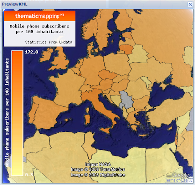
I released a new version of the Thematic Mapping Engine today as a response to this discussion. The most noticeable new feature is the enhanced colour scale. It's difficult to make a symbol legend in KML, as symbol size varies with scale (zoom). Without a legend, it's very hard to assess the exact values.
This is why I duplicate symbology by supporting a colour legend. You can now easily define a colour scale for all thematic mapping techniques. The colour legend informs the user about the range of values (min and max), and where the different symbols are positioned on this range.
The colour scale can be unclassed or classed:
Here is a few examples (all statistics from UNdata):
I released a new version of the Thematic Mapping Engine today as a response to this discussion. The most noticeable new feature is the enhanced colour scale. It's difficult to make a symbol legend in KML, as symbol size varies with scale (zoom). Without a legend, it's very hard to assess the exact values.
This is why I duplicate symbology by supporting a colour legend. You can now easily define a colour scale for all thematic mapping techniques. The colour legend informs the user about the range of values (min and max), and where the different symbols are positioned on this range.
The colour scale can be unclassed or classed:
- Equal intervals: Each colour class occupies an equal interval along the value range.
- Quantiles: The countries are rank-ordered and equal number of countries are placed in each colour class. Quantiles are not available for time series.
Here is a few examples (all statistics from UNdata):
 Life expectancy at birth, 2005 (equal intervals).
 Life expectancy at birth, 2005 (quantiles).
 Aids estimated deaths, aged 0-49, 2005 (equal intervals).
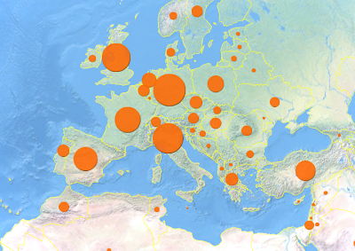
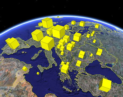
 Eye candy: Mobile phone subscribers, 2004 (unclassed).
Try it yourself!
Thursday, 19 June 2008
Animating mobile phone subscribers...
Ok, this is probably in the "how to sacrifice accuracy for eye candy" category, but it's still fun! Here is Mobile phone subsribers (statistics from UNdata) visualised using a proportional 3D mobile phone:
 Mobile phone subscribers in 2003 (download KMZ). 3D phone from Mikeyjm/3D Warehouse. I'm using volume as the scaled parameter, which I think is more accurate than using area or height.
 Mobile phone subscribers in 2003 (download KMZ). 3D phone from Mikeyjm/3D Warehouse. I'm using volume as the scaled parameter, which I think is more accurate than using area or height.
  You can even change the colour of the cover... :-o
Animated version (1980-2004):
Download KMZ (NB! You need a quick computer!)
I've added a 3D mobile phone and a 3D person (both from 3D Warehouse) to the Thematic Mapping Engine, so you can make this visualisation yourself.
Tuesday, 17 June 2008
Why 3D is not working #4: Am I sacrificing accuracy for eye candy?
The last issue I want to address in my 3D series is the problems of perspective. I find this issue particulary challenging.
“Same with estimating sizes of oblique-viewed 3D domes for proportional symbols. The problem is further magnified when the data is re-projected to an Earth globe view making the task of estimating heights/sizes of the polygons even harder (since the user has to mentally compensate for the curvature of the earth). In short their concern is we are sacrificing accuracy for eye candy.” (Sean Gorman)
Yes, the use of proportional symbols on a 3D globe raises some serious questions. Here are my 3D Collada domes of world population:
 Download KMZ.
At least, the dome shape makes it possible to calculate the volume of each object, as the volume should represent the statistical value. I'm not sure how to scale irregular objects properly, - like a 3D person.
The main issue, as stated by Sean above, is how the user are going to estimate the volume of the domes when seen in perspective. The size of the domes are determined by two factors: the size of the population and the "distance" from the point of view. This makes it hard to compare 3D objects.
One solution is to use a non-perspective projection (orthogonal projection) which makes it easier to make cross-scene comparsions (Shepherd, 2008). Using proportional images with the KML Icon element might be an option.
 Download KMZ. These symbols keep their relative size when you spin the globe. But what if the user expects the symbols to be scaled as the domes? If I overlay the two symbols it looks like this:
 The result is clearly different from a viewer's perspective! Is it possible to do proportional symbol mapping accurately on a 3D globe, or should it be avoided? I'm not sure.
Reference:
Shepherd, I. D. H., 2008, “Travails in the Third Dimension: A Critical Evaluation of Three-dimensional Geographical Visualization”. Book chapter in "Geographic Visualization: Concepts, Tools Applications".
“Same with estimating sizes of oblique-viewed 3D domes for proportional symbols. The problem is further magnified when the data is re-projected to an Earth globe view making the task of estimating heights/sizes of the polygons even harder (since the user has to mentally compensate for the curvature of the earth). In short their concern is we are sacrificing accuracy for eye candy.” (Sean Gorman)
Yes, the use of proportional symbols on a 3D globe raises some serious questions. Here are my 3D Collada domes of world population:
Download KMZ.At least, the dome shape makes it possible to calculate the volume of each object, as the volume should represent the statistical value. I'm not sure how to scale irregular objects properly, - like a 3D person.
The main issue, as stated by Sean above, is how the user are going to estimate the volume of the domes when seen in perspective. The size of the domes are determined by two factors: the size of the population and the "distance" from the point of view. This makes it hard to compare 3D objects.
One solution is to use a non-perspective projection (orthogonal projection) which makes it easier to make cross-scene comparsions (Shepherd, 2008). Using proportional images with the KML Icon element might be an option.
The result is clearly different from a viewer's perspective! Is it possible to do proportional symbol mapping accurately on a 3D globe, or should it be avoided? I'm not sure.Reference:
Shepherd, I. D. H., 2008, “Travails in the Third Dimension: A Critical Evaluation of Three-dimensional Geographical Visualization”. Book chapter in "Geographic Visualization: Concepts, Tools Applications".
Why 3D works #3: Mother Earth gives us a clue
Since I'm on a 3D choropleth jag, I want to address two common problems with prism maps; blocking and lack of north orientation.
“Its possible that a high oil consumption of one country would obscure (or at least complicate the view if the 3D models are translucent) the consumption of a country located behind it, meaning I have to 'fly' around to see the value related to that country.” (Rich Treves)
I agree with this statement, even though it's possible to guide the user in various ways:
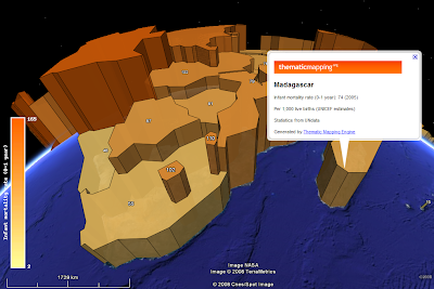
In my first and second blog post in this 3D series, I explained why I'm using two visual variables (colour and height) to represent the same statistical indicator. This is another good reason; colour might help the user in identifying hidden prisms.
 This prism map is created with the Thematic Mapping Engine, and shows life expectancy at birth (both sexes) in 2005. I'm not using a colour scale to represent the statistical value. The prism representing the low life expextancy in Afghanistan is hidden behind Pakistan.
 If you look at the prisms from above, the "shadows" helps you to identify the lower life expectancy in Afghanistan, but it's hard to measure the relative height.
 By adding a colour scale, it's easier to see that Afghanistan is experiencing lower life expectancy than the neighbouring countries. This is a suggested solution by Slocum (2005/70).
“You are being redundant though by using color and prism height to show the same variable. It might be more interesting (and complicated!) to use the height to show something else to compare to internet usage.” (Cory Eicher)
Not everyone likes this approach. Two different visual variables (colour and height) might also mean two different statistical indicators. I think it would be more confusing to combine two indicators on a prism map like this. I would appreciate more feedback about how people precieve prism maps using both height and colour for the same statistical indicator.
I agree with Cory that combining two indicators might be more interesting (depending on what you are looking for), but I think another approach could be used with greater success. I'll return to bivariate mapping later.
“Its possible that a high oil consumption of one country would obscure (or at least complicate the view if the 3D models are translucent) the consumption of a country located behind it, meaning I have to 'fly' around to see the value related to that country.” (Rich Treves)
I agree with this statement, even though it's possible to guide the user in various ways:
In my first and second blog post in this 3D series, I explained why I'm using two visual variables (colour and height) to represent the same statistical indicator. This is another good reason; colour might help the user in identifying hidden prisms.
 This prism map is created with the Thematic Mapping Engine, and shows life expectancy at birth (both sexes) in 2005. I'm not using a colour scale to represent the statistical value. The prism representing the low life expextancy in Afghanistan is hidden behind Pakistan.
 If you look at the prisms from above, the "shadows" helps you to identify the lower life expectancy in Afghanistan, but it's hard to measure the relative height.
 By adding a colour scale, it's easier to see that Afghanistan is experiencing lower life expectancy than the neighbouring countries. This is a suggested solution by Slocum (2005/70).
“You are being redundant though by using color and prism height to show the same variable. It might be more interesting (and complicated!) to use the height to show something else to compare to internet usage.” (Cory Eicher)
Not everyone likes this approach. Two different visual variables (colour and height) might also mean two different statistical indicators. I think it would be more confusing to combine two indicators on a prism map like this. I would appreciate more feedback about how people precieve prism maps using both height and colour for the same statistical indicator.
I agree with Cory that combining two indicators might be more interesting (depending on what you are looking for), but I think another approach could be used with greater success. I'll return to bivariate mapping later.
A reason why KML is good for thematic mapping is the FlyToView, Camera and LookAt elements. By using these elements we can automatically fly the user to the best "prism viewing location" (not so easy with whole world visualisations...), or to the location where we want to draw the attention. This might create another problem, as rotation and perspective might produces a view that is unfamiliar to users who normally see maps with north at the top (Slocum et al., 2005). This is a bigger challenge for paper-based prism maps than digital ones, since the user can switch easily between different scales to restore geographical orientation.
Still, we're here at a key point: 3D visualisations tend to impose severe interaction demands on users (Shepherd, 2008/201). This can also be beneficial, as the user might learn and see more in interactive and explorative environments.
References:
Slocum, T. A, 2005, "Thematic Cartography and Geographic Visualization", Second Edition, Pearson Education, Inc
Shepherd, I. D. H, 2008, “Travails in the Third Dimension: A critical Evaluation of Three-dimensional Geographic Visualization.” Book chapter in Dodge, M., McDerby, M. and Turner, M., 2008, “Geographic Visualization: Concepts, Tools and Applications”, Wiley.
Monday, 16 June 2008
Why 3D works #2: It’s all about prisms
It’s seems like people have a love/hate relationship with prism maps. Here are some of the arguments in the “don’t like” category together with my counter-arguments:
“IMHO creating coropleth maps using prisms is not really *efficient* (but of course it’s spectacular) because it’s really hard (at least for me, maybe I’m too “plain”) to realize slight differences between non-contiguous areas. In fact you are using to techniques to present the same variable, color and prism height. As I see, the classic way to present a quantitative variable using the amount of brightness and just one value (color) is more efficient independently of using a 2D or a 3D environment.” (XuRxO)
“If I wanted to find out the exact value of oil consumption for a particular country on the thematic map I can easily glance at the colors in the key to pinpoint the value. With consumption converted to height in Google Earth its difficult to read off the actual value.” (Rich Treves)
“I was talking to some cartographer friends about the recent proliferation of 3D thematic maps and they had some concerns about their utility and accuracy. Specifically they pointed to testing that has shown people stink at estimating heights of the countries and have the hardest time telling the most basic differences in height.” (Sean Gorman)
I’ll stick to the “Infant Mortality Rate” visualisation introduced in my last blog post:
 Prism map (download KMZ).
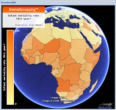 Choropleth map (download KMZ).
The best solution is to select a visual variable that match the level of measurements (nominal, ordinal or numerical) of the data (Slocum et al., 2005). Hue (colour) is the best way to represent nominal data, ordered hues (e.g. yellow, orange, red) or lightness are the best ways to represent ordinal data, while perspective height (prism) is the best way to represent numerical data (page 72). Clearly, brightness/hue is not the only "classic way" of representing numerical data.
The reason why perspective height gets the highest rank by Slocum (2005/70) is that an unclassed prism map will portray ratios correctly, since a value twice as large as another will be represented by a prism twice as high. Slocum also identifies two problems of prism maps; that tall prisms sometimes block smaller prisms and that rotation might produce a view that is unfamilar to users. This is the topic of my next blog post in this series.
If you look at the two images above (or in Google Earth) I will argue that the prism map is able to convey more detail than the choropleth map. I find it easier to see how the infant mortality rate varies across the continent, and to compare countries adjacent to each other.
I agree with Rich that a colour legend helps the user to pinpoint a value, even though it's impossible to identify the exact value by this method. A height legend is diffult to make since the scale is changing. Still, I think legends are more important for paper maps than digital maps. On a digital map you should always be able to obtain the value by clicking a feature.
 In Google Earth, a Point Placemark is the only object you can click or roll over. You can click on a polygon by holding down the shift-key, but this is not very user friendly. Collada objects are not clickable at all. Google, I wont sleep well until this is fixed ;-)
In conclusion, - try a prism map if you deal with numerical data and have 3D at your disposal!
References:
Thematic Cartography and Geographic Visualization, Second Edition 2005, Terry A. Slocum et al., Pearson Education, Inc
“IMHO creating coropleth maps using prisms is not really *efficient* (but of course it’s spectacular) because it’s really hard (at least for me, maybe I’m too “plain”) to realize slight differences between non-contiguous areas. In fact you are using to techniques to present the same variable, color and prism height. As I see, the classic way to present a quantitative variable using the amount of brightness and just one value (color) is more efficient independently of using a 2D or a 3D environment.” (XuRxO)
“If I wanted to find out the exact value of oil consumption for a particular country on the thematic map I can easily glance at the colors in the key to pinpoint the value. With consumption converted to height in Google Earth its difficult to read off the actual value.” (Rich Treves)
“I was talking to some cartographer friends about the recent proliferation of 3D thematic maps and they had some concerns about their utility and accuracy. Specifically they pointed to testing that has shown people stink at estimating heights of the countries and have the hardest time telling the most basic differences in height.” (Sean Gorman)
I’ll stick to the “Infant Mortality Rate” visualisation introduced in my last blog post:
 Prism map (download KMZ).
 Choropleth map (download KMZ).
 The best solution is to select a visual variable that match the level of measurements (nominal, ordinal or numerical) of the data (Slocum et al., 2005). Hue (colour) is the best way to represent nominal data, ordered hues (e.g. yellow, orange, red) or lightness are the best ways to represent ordinal data, while perspective height (prism) is the best way to represent numerical data (page 72). Clearly, brightness/hue is not the only "classic way" of representing numerical data.
The reason why perspective height gets the highest rank by Slocum (2005/70) is that an unclassed prism map will portray ratios correctly, since a value twice as large as another will be represented by a prism twice as high. Slocum also identifies two problems of prism maps; that tall prisms sometimes block smaller prisms and that rotation might produce a view that is unfamilar to users. This is the topic of my next blog post in this series.
If you look at the two images above (or in Google Earth) I will argue that the prism map is able to convey more detail than the choropleth map. I find it easier to see how the infant mortality rate varies across the continent, and to compare countries adjacent to each other.
I agree with Rich that a colour legend helps the user to pinpoint a value, even though it's impossible to identify the exact value by this method. A height legend is diffult to make since the scale is changing. Still, I think legends are more important for paper maps than digital maps. On a digital map you should always be able to obtain the value by clicking a feature.
 In Google Earth, a Point Placemark is the only object you can click or roll over. You can click on a polygon by holding down the shift-key, but this is not very user friendly. Collada objects are not clickable at all. Google, I wont sleep well until this is fixed ;-)
In conclusion, - try a prism map if you deal with numerical data and have 3D at your disposal!
References:
Thematic Cartography and Geographic Visualization, Second Edition 2005, Terry A. Slocum et al., Pearson Education, Inc
Why 3D works #1: Looking on the other side
I appreciate all the feedback I’ve got in emails, on this blog and on other blogs. Especially, I’m thankful for critical feedback as this is helping me in addressing important issues. Most of the critical comments are questioning the effectiveness of 3d globe visualisations, which are widely used on this blog.
We definitely need to think critically about the pros and cons of 3D visualisations. I want to give my response in a series of blog posts.
Rich Treves made a comment where he linked to his blog post “3D Rears its Ugly Head Again”. This is the first of his three arguments against 3D KML (Rich, excuse me for taking your arguments out of context!):
“I can't compare the Oil consumption of UK and Australia at the same time because they are on different sides of the globe.”
True, the ability to compare all countries is lost when thematic maps are rendered on a globe. Still there are various ways to address this issue:
1. I’m using two visual variables (colour and height) to represent the same statistical indicator. This makes country comparison easier when spinning the globe.
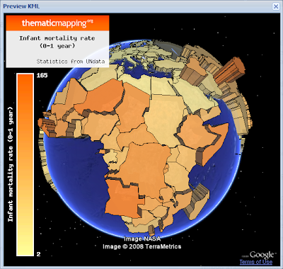
 I could not find oil consumption statistics at UNdata, so I'm using "Infant Mortality Rate" instead (per 1,000 live births). You can make the map in the Thematic Mapping Engine, or download the KMZ file here. I think this is a good and effective 3D visualisation.
2. Values can be displayed on the globe, which makes country comparisons much more accurate.
 I added this feature to the Thematic Mapping Engine yesterday. More info will come in a separate blog post.
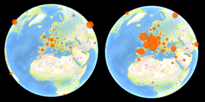
3. Another option, which is now possible with the new Google Earth plugin, is to have two spinning globes in the same window.
 Click here for a live example (based on the China Syndrome example from Google Code). If you rotate the left globe, the right globe will show you the view on the other side. I think it would be better to enable the user to rotate the two globes indepentantly.
4. A different approach is leave the globe, but hold on to 3D KML using a tool like UUorld, where you have 3D prisms on a flat world map.
 Currently, there are no 3D KML renderers that are able to make such visualisations, but I’m sure there will be in the near future. Maybe a job for the UUorld guys? UUorld seems to use Plate Carrée (Equidistant cylindrical) projection. This is clearly not the best choice for thematic world maps, but it’s the same projection currently supported by KML (EPSG:4326).
In conclusion, country comparisons are problematic on a 3D globe, but it shouldn’t stop us from doing it!
We definitely need to think critically about the pros and cons of 3D visualisations. I want to give my response in a series of blog posts.
Rich Treves made a comment where he linked to his blog post “3D Rears its Ugly Head Again”. This is the first of his three arguments against 3D KML (Rich, excuse me for taking your arguments out of context!):
“I can't compare the Oil consumption of UK and Australia at the same time because they are on different sides of the globe.”
True, the ability to compare all countries is lost when thematic maps are rendered on a globe. Still there are various ways to address this issue:
1. I’m using two visual variables (colour and height) to represent the same statistical indicator. This makes country comparison easier when spinning the globe.
 I could not find oil consumption statistics at UNdata, so I'm using "Infant Mortality Rate" instead (per 1,000 live births). You can make the map in the Thematic Mapping Engine, or download the KMZ file here. I think this is a good and effective 3D visualisation.
2. Values can be displayed on the globe, which makes country comparisons much more accurate.
 I added this feature to the Thematic Mapping Engine yesterday. More info will come in a separate blog post.
3. Another option, which is now possible with the new Google Earth plugin, is to have two spinning globes in the same window.
 Click here for a live example (based on the China Syndrome example from Google Code). If you rotate the left globe, the right globe will show you the view on the other side. I think it would be better to enable the user to rotate the two globes indepentantly.
4. A different approach is leave the globe, but hold on to 3D KML using a tool like UUorld, where you have 3D prisms on a flat world map.
 Currently, there are no 3D KML renderers that are able to make such visualisations, but I’m sure there will be in the near future. Maybe a job for the UUorld guys? UUorld seems to use Plate Carrée (Equidistant cylindrical) projection. This is clearly not the best choice for thematic world maps, but it’s the same projection currently supported by KML (EPSG:4326).
In conclusion, country comparisons are problematic on a 3D globe, but it shouldn’t stop us from doing it!
Tuesday, 10 June 2008
Proportional symbols in Thematic Mapping Engine
Thematic Mapping Engine (TME) is now supporting proportional symbols and choropleths in addition to prism maps. Three different types of proportional symbols are supported:
1. Images
By selecting this option, you can choose between two images (so far) which are scaled according to a statistical value. This blog posts explains how this is achieved.
 This map shows number of mobile telephone subscribers in 2003.
 Same indicator, but with different image shape and colour.
If you compare the result in the Google Earth browser plugin with the desktop program, you'll see a noticeable difference: The icons are much bigger in the plugin. The reason is different viewport sizes, and I consider this to be a Google Earth bug. I'm probably using the KML Icon element in a way that was not intended. Look at these images which are from the same KML file:
 There are two different ways adjusting the size of the planet in Google Earth. The left visualisation shows the earth in a zoomed out view. The circle images are scaled properly. You can also change the size of the planet by adjusting the Google Earth window. The problem is that the circle images maintains their size while the planet shrinks or expands.
Still, this option works quite well if you have a fixed viewport for Google Earth.
2. Regular polygons
The second option is to draw regular polygons as KML features. Unfortunately, KML has no build-in support for regular polygons, so these polygons have to created by complex calculations. Luckily, this is hidden behind the scenes of the Thematic Mapping Engine.
 The result is not nice looking in Google Earth. The satellite imagery distracts the view, and the borders are placed on top of the polygons. Other KML renderers might do a better job. It's also impossible to make perfect geometric shapes with this technique.
3. Collada objects
The last option is to use 3d Collada objects. These visualisations might be eye candy, but I'm not sure how effective they are in conveying geographical patterns. There are also some scaling issues which I'll write about later.
 A 3d variation of mobile telephone subscribers in 2003.
Choropleths
I've also added choropleths as an alternative to prism maps.
 The country polygons are shaded according to the number of mobile phone subscribers per 100 inhabitants.
You can try the Thematic Mapping Engine here. Please provide your feedback!
All statistics from UNdata.
Thursday, 5 June 2008
Thematic mapping and the Google Earth plugin
Thanks for all the feedback after my initial release of Thematic Mapping Engine. Two features have been requested; data upload/import and support for the new Google Earth plugin. I've now added a Preview-button, which enables you to see thematic maps in the browser instead of switching between two applications.
 The Google Earth plugin seems to render big and complex KML files very well. The image above shows GDP per capita in 2005.
 A missing feature is support for KML time primitives. The TimeSpan and TimeStamp elements are not supported, and the plugin renders all the polygon features regardless of the time specified (above image). This will hopefully be fixed in a future release.
With the new Google Earth plugin it's possible to create a highly interactive and explorative user interface for geovisualisation. The plugin can be combined with other visualisation gadgets in a way that is not possible in Google Earth. As applications move from the desktop to the web, there will be a great demand for JavaScript experts who know how various APIs and libraries can be combined.
By the way, Thematic Mapping Engine still works without the Google Earth plugin - just click the Download-button.
 The Google Earth plugin seems to render big and complex KML files very well. The image above shows GDP per capita in 2005.
 A missing feature is support for KML time primitives. The TimeSpan and TimeStamp elements are not supported, and the plugin renders all the polygon features regardless of the time specified (above image). This will hopefully be fixed in a future release.
 With the new Google Earth plugin it's possible to create a highly interactive and explorative user interface for geovisualisation. The plugin can be combined with other visualisation gadgets in a way that is not possible in Google Earth. As applications move from the desktop to the web, there will be a great demand for JavaScript experts who know how various APIs and libraries can be combined.
By the way, Thematic Mapping Engine still works without the Google Earth plugin - just click the Download-button.
Subscribe to:
Posts (Atom)